Merchants of Play Discord Activity
Client: Merchants of Play
Role: Founding Product Designer/Head of Design
Responsibilities: product vision, UX/UI design, game design, user flows, wireframing, prototyping, visual design, user testing,
Duration: 9 months (Nov 2024 - Jul 2025)
Tools:

The story begins…
It was my first day on the job. In our daily standup, our CEO said, “We’re doing a new thing starting today. We’re not building a playtest tool anymore. I want to make ‘Steam for Board Games.’ That’s our new direction, and we’re basically going to start from scratch.”
In that moment, I saw an opportunity not just to design a product, but to shape a new kind of experience—one that could redefine how people gather, play, and create community online. From Day 1, I took point on crafting a product vision, brand identity, and user experience that were as scalable as they were soulful.
Overview
Merchants of Play is a Canadian game company founded by the Godfather of NFTs, Mack Flavelle. Our goal was to build a Discord activity to allow users to play board games online, and to do it more intuitively and elegantly than our competitors TableTopia, Table Top Simulator, and Board Game Arena.
In addition, we sought to create a medium where independent game developers and publishers could build an audience and increase sales of their own games (when tied to a Kickstarter launch, for example). Unlike the vast majority of our competitors, we developed a pipeline where a game designer could see their game in our app within a number of days, rather than the months that it took for other platforms.
We launched the Beta version of our Merchants of Play activity in late June of 2025.
Team
Aside from Mack, who served as Product Owner, I also worked hand-in-hand with a global team of incredibly talented and innovative engineers including Gustavo Konrad, Dan Viau, Pooryia Raad, Fabiano Soriani (frameworks and functionality), Michael Zsigmond (front-end development, project management, and sales), Jakub Adamski (3D modeling), and Keo Jimal (QA and testing).
Goals
Allow users to play board games online with their friends through a simple, intuitive, and delightful interface
Increase discoverability and drive sales for small publishers and independent game designers
Become the go-to app for gamers and game designers alike
Highlights
8
Games available on launch, with 6 more in production
10,000
Players reached
45m
Average play time


Project Details
Act I: The Spark — Setting Sail
Background
Merchants of Play began as Tinker Table, a platform for board game designers to playtest with players worldwide. On Day 1, we pivoted. Rather than replicate what already existed, I pushed for a product that transcended simulation—a platform that felt native to digital play, but still honored the tactile joy of physical games. This meant designing not just tools, but a world players would want to inhabit.
Challenge: Immediate Rebrand Needed
The parent company’s original name, BigHead Club, carried heavy crypto and NFT associations that alienated our target audience. I aligned the team around a shared brand vision, positioning Merchants of Play as a fresh alternative to crypto-tainted competitors and building the design system that powered product scalability.
I led a rapid-fire aesthetic exploration sprint, grounding each direction in a potential future identity. The team gravitated toward a Raygun Gothic visual language—retro-futurist, optimistic, and deeply tactile. That choice didn't just set a vibe; it became a guiding principle for how we named, styled, and architected every user-facing element.


Refining the Brand
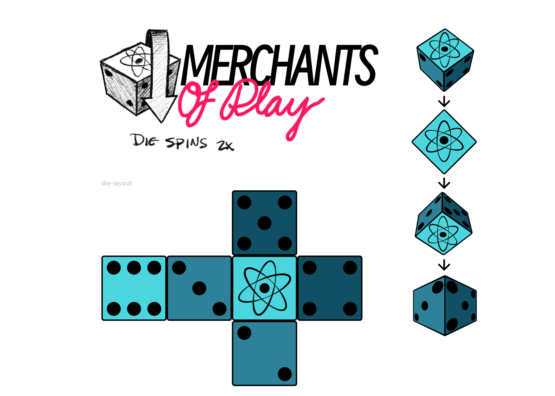
Once we had our specific vibe down, I spent some time exploring different brand expressions; I knew we wanted to communicate that we were a game company that had a distinctive and future-thinking approach to digital tabletop games. I drew a lot of inspiration from old 1950s and 60s motel signs, bowling alleys, and drive-ins, and after a few rounds of iteration I found the perfect combination.
Because the brand name wouldn’t be plastered all over the app experience I made sure we included a loading screen that would appear throughout the user journey. I put together a prototype in Figma and art-directed our 3D modeller, who built the artifacts and turned them into an animation that we could plug into our product.
The end result was a solid base for me to build the atomic elements of the design system, create the content voice, and set out creating a memorable world for our users to play in.

Above Left: Much inspiration was taken from old hotel and motel signs from the 1950s and 60s, but early designs felt too complex to work well as a logo.
Above Right: Concept sketch and die animation artifacts I created for our 3D modeller.
Above: The four mood boards I put together for our branding exercise.
Act II: Building the World — Exploring and Refining
The Radlands Experiment
We quickly pitched our Discord concept to Roxley Games, makers of Radlands, a cyberpunk card game with no existing digital version. I led the creation of wireframes and interaction flows that translated in-person tabletop play into a natural, intuitive digital experience.
Although Roxley loved the vision and speed, they weren’t ready to partner until we’d proven the platform. This early pitch proved our ability to quickly prototype and communicate a compelling vision—critical for securing partners and investor confidence. It also solidified our approach: focus on simple, elegant gameplay that honored the feel of playing in-person.


Above: Wireframes for our initial Radlands concept.
Below: Final designs I created for Mack’s pitch to Roxley Games.


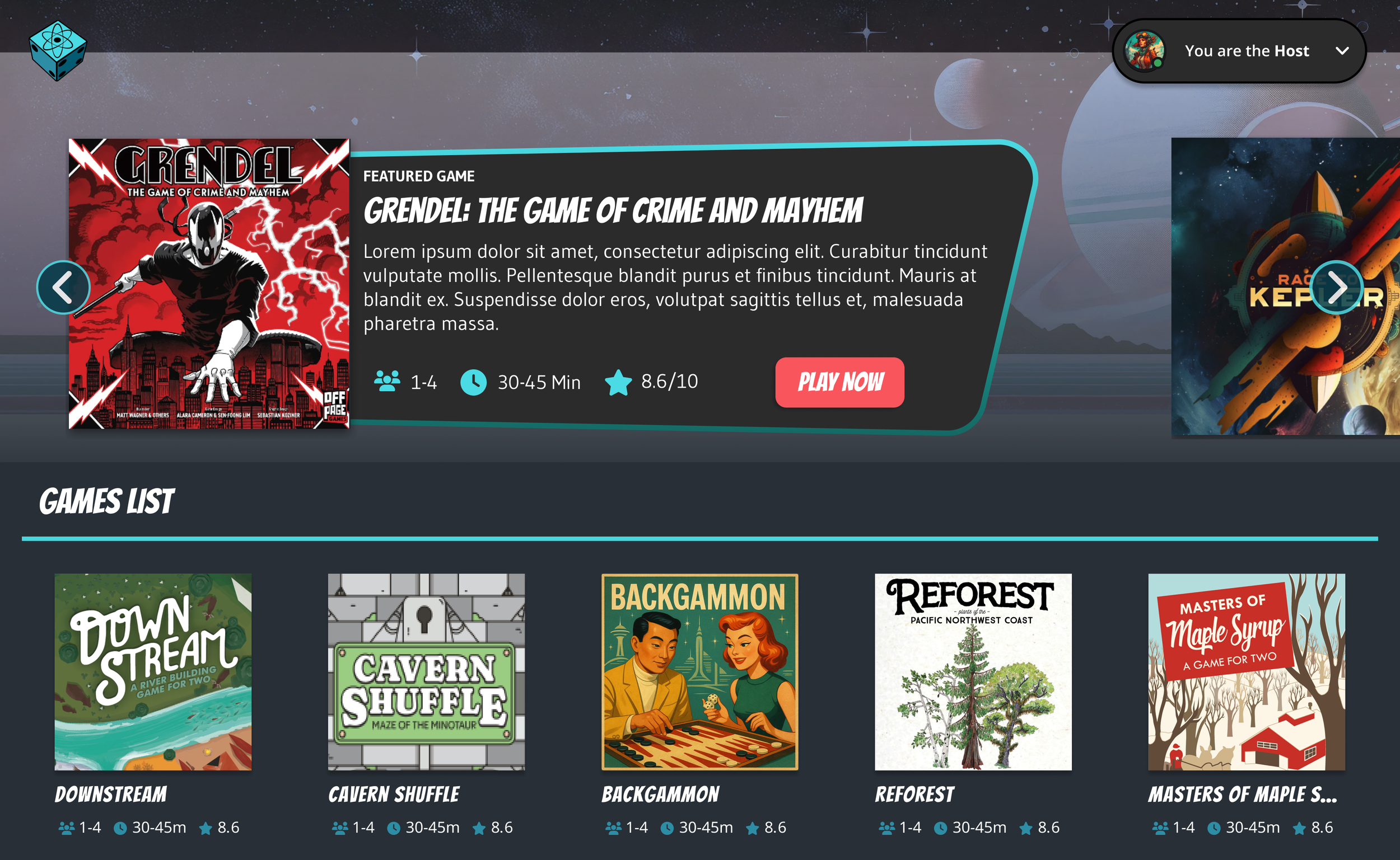
Building our Platform
Rather than build a standalone Discord activity for each game, I designed a Netflix-style “game store within a store” where players could browse titles, invite friends, and save favorites.
During this time I established our design language and naming conventions for components and our product as a whole. I envisioned our activity as a spaceship corridor: each game existed behind a door, with a pre-launch screen, which I named the “Airlock,” where players gathered before starting a session. This concept fit seamlessly with our Raygun Gothic brand and gave the experience a sense of narrative cohesion.
Every interaction became an opportunity to build lore and continuity. Naming conventions like “Airlock” weren’t just cute—they helped us frame gameplay as narrative, adding depth and cohesion to the entire platform.


Above Left: A quick sketch of a mental map showing the possible hierarchy of our activity.
Above Center/Right: Sketched wireframes of our home screen and product detail screen. While this definitely changed, the basic concept can be seen in the final design.
Below: A wireframe flow for my single-screen Netflix-style design, with dev notes included.

Below Left: Final design (sans content) of the expandable product detail section
Below Right: The “Airlock” screen provided a space for each player to ready-up before launch.


Operational Challenges
With no dedicated front-end developer, I leaned into developer tools and AI-assisted workflows, rapidly generating HTML/CSS prototypes and iterating in tandem with engineering. Constraints became a forcing function for clarity—and our tight feedback loop helped us punch far above our weight.
Drawing on my extensive experience writing front-end code, I created detailed, developer-friendly specs using specific HTML/CSS/Tailwind adjustments (see image right). This facilitated tight design-engineering feedback loops to preserve design intent despite a lack of dedicated FED resources.
Future-proofing with Design Systems
As an experienced design leader with a deep love of design systems, I made it a priority to establish one as quickly and mindfully as possible. I knew this would not only allow us to reduce developer load by building reusable components, but would also ensure a consistent experience and brand expression across multiple games with often wildly different design aesthetics and colour schemes.
I worked closely with the engineering team to ensure that what I was building would be well-organized and would be meaningful and relevant to the work they were doing.
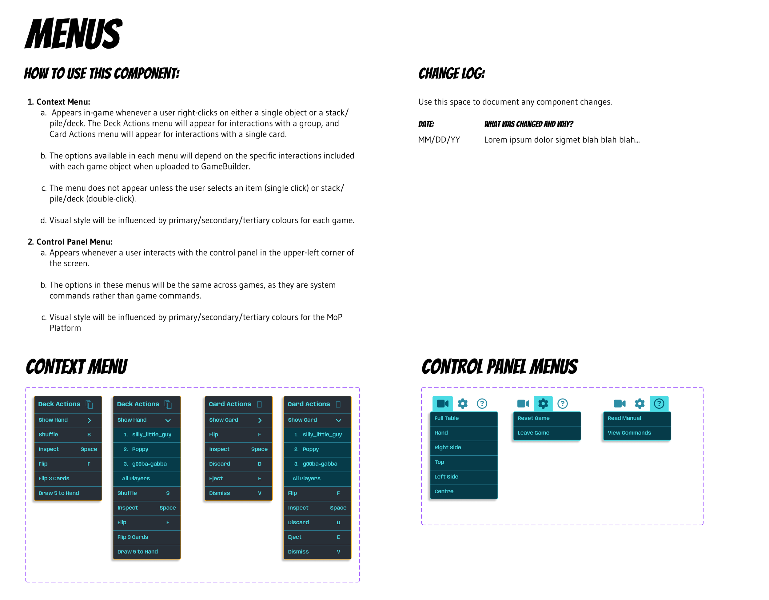
Above: A sample from the “Menus” section of the design system I built and implemented.
Act III: Trials & Breakthroughs — Wrestling with Complexity
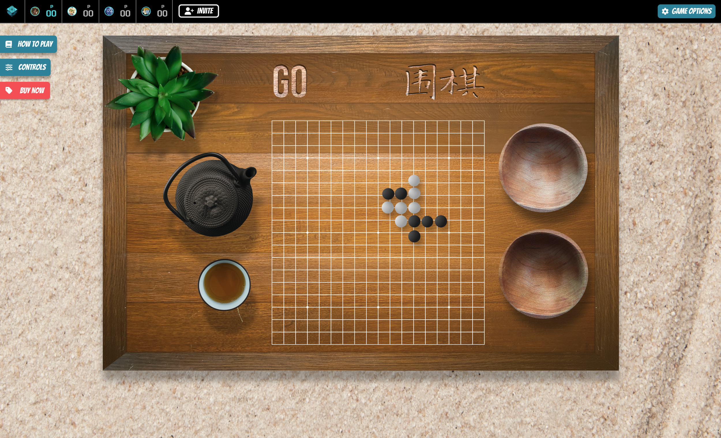
Crafting the Game Experience
One of my biggest challenges was creating a unified interface across diverse games without sacrificing each game’s unique feel. I drew heavily upon my understanding of not only design, but also philosophy, applying concepts found in Taoism and Zen Buddism. I led the approach to in-game UX by applying the principles of wu wei, or “effortless action,” in maintaining a flow between tasks that felt natural rather than forced.
I designed a master list of core player artifacts and interactions and collaborated with engineers to ensure that each game felt like a standalone product but still an intentional part of our ecosystem. Early signed titles like Race to Kepler and The Masters of Maple Syrup gave us real-world test cases to refine both visuals and interactions.


Above Left: One of the earliest design challenges was deciding the best way to arrange each player mat with the limited camera movement we started out with.
Above Right: One of our earliest signers was the Canadian indie company Firestarter Games, who now has their entire catalog available on Merchants of Play.
Key UX Problems & Solutions:
1. Rule enforcement vs. freedom
We chose not to enforce game rules programmatically to maintain platform flexibility. This raised a new question:
How do we guide players when they get stuck?
Solution: I built a “Quick Reference” card and an Inspect modal for each game, making it easy to review actions, flip cards, and access full manuals without interrupting play.
2. Static vs. skeuomorphic environments
Competitors either built overly complex 3D environments or flat, uninspiring top-down views.
Solution: I bridged the gap, designing a dynamic but intuitive layout. Shared actions lived at the top of the screen, while personal player mats anchored the bottom. This approach reduced complexity without sacrificing engagement.

User Testing Insights
Early user testing (informal with my kids, then formal with playtesters in the Philippines) revealed key friction points:
Players couldn’t easily find the rules.
Controls were hidden in menus.
Players didn’t know how to leave a game without quitting the entire activity.
I reworked the UI to surface critical actions (“How to Play,” “Controls,” “How to Buy”) directly in the viewport. This eliminated confusion and gave the interface the right balance of elegance and usability.


Onboarding & Delight
Because we opted not to enforce rules, onboarding was critical. I first tried a simple text modal, followed by a sticky banner at the top of the screen, but they both lacked personality.
I designed “Moppy,” a small robot guide who appeared with playful speech bubbles to explain roles, transitions (like entering the Airlock), and core actions. Moppy helped inject lore and charm into the experience, though he was eventually shelved until we could better weave backstory into the product.


Act IV: The Final Form — Launch & Outcomes
Spreading the Word
As launch neared, I expanded my role into brand storytelling, scripting and producing launch videos that aligned marketing and product, and helped acquire both users and game designer partners. I wrote scripts, recorded voice-overs, and edited two promo videos—one specifically for players, the other for designers—which were published on our social media channels.
Making an Impact
We launched Merchants of Play on Discord on June 16, 2025. Feedback was immediately positive, with players reporting strong engagement and few bugs.
One highlight was a post-launch investor meeting with tennis star Serena Williams, where we delighted her with a custom version of Uno (dubbed “Ser-Uno”) built specifically for the demo.

Epilogue & Takeaways
Though my time with Merchants of Play ended in July 2025, the vision, design system, and product foundation I built continue to guide the team. The experience reaffirmed my belief that the most impactful products aren’t just well-designed—they’re rooted in a clear, compelling future that everyone on the team can see.
This project reinforced three key lessons:
Clarity beats elegance when users are learning.
Strong design systems make small teams scalable and future-proof.
The best ideas (like Airlock and Moppy) come when brand and product are inseparable.