Merchants of Play Discord Activity
Client: Merchants of Play
Role: Founding Product Designer/Head of Design
Responsibilities: Product vision, UX/UI design, game design, user flows, wireframing, prototyping, visual design, user testing, brand design
Duration: 9 months (Nov 2024 - Jul 2025)
Tools:

Overview
When Merchants of Play pivoted to create the Steam for board games, I was the sole designer leading the charge. I set the vision, established a playful but cohesive brand identity, and built a scalable design system that empowered engineers to move fast without losing consistency. From research to refinement to launch, I guided the team through uncertainty and shaped a platform that brought digital board gaming to life.
Goals
Allow users to play board games online with their friends through a simple, intuitive, and delightful interface
Increase discoverability and drive sales for small publishers and independent game designers
Become the go-to app for gamers and game designers alike
Highlights
8
Games available on launch, with 6 more in production
10,000
Players reached
45m
Average play time
Project Details
The Challenge
On my very first day, the CEO announced we were pivoting the company in a completely new direction: building the Steam for board games. There was no roadmap, no playbook, and no precedent.
As the sole designer, I immediately stepped into leadership, setting the product vision, defining the brand identity, and aligning a distributed team of engineers around a shared direction.
Exploration & Vision
To bring the idea to life, I anchored the product in a distinctive brand language. Drawing from retro-futurist “Raygun Gothic” influences, I created player experiences like our Airlock prelaunch screen and our short-lived robotic mascot Moppy, which together gave the platform a playful but coherent identity. My goal was to ensure that every interaction felt like part of the same world.
Above: Early brand explorations that set the product’s visual identity and tone.
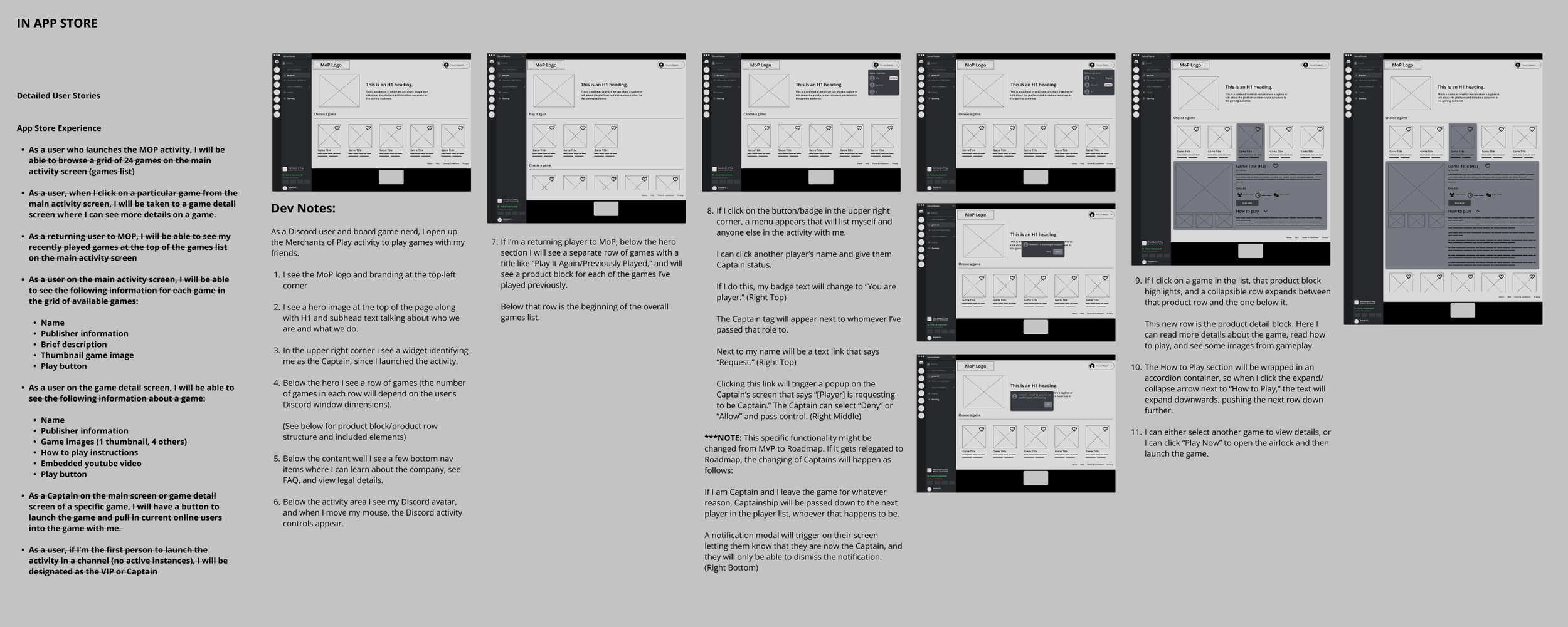
But vision only works if it connects with people. I conducted user research with both casual and hobbyist players to uncover pain points in discovering, learning, and playing digital board games. That feedback shaped early wireframes and guided me as I balanced the needs of very different audiences, from tabletop veterans to newcomers.
Once the team aligned on the vision, I shifted focus to systems design — building the scaffolding that would let us scale across multiple games and mechanics.
Systems & Alignment
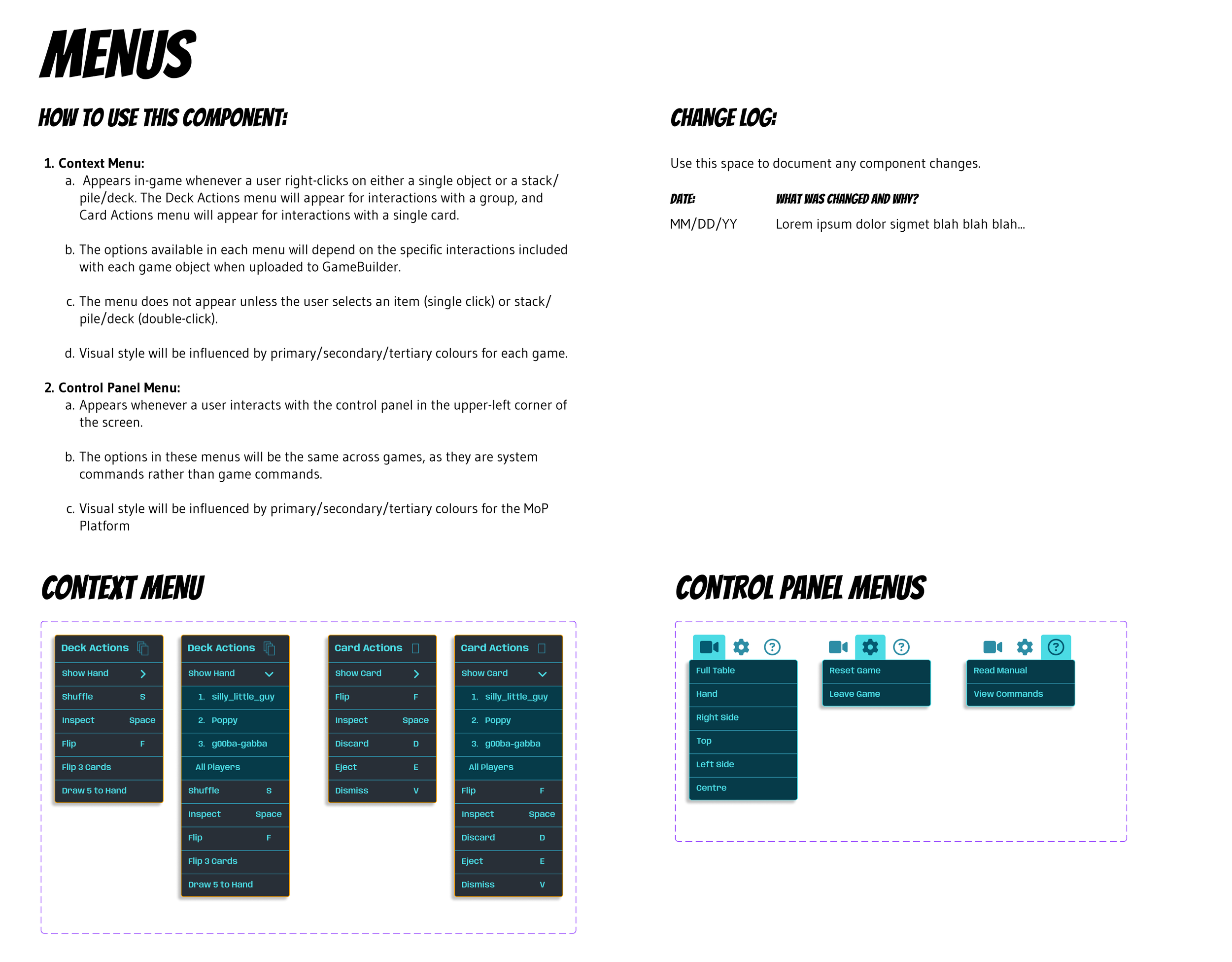
Without a dedicated front-end engineer, the team needed me to go beyond concepts. I built a flexible design system, complete with detailed specs, so engineers could ship features quickly without guesswork. This early decision paid off: it reduced design debt, created consistency across the platform, and gave our developers a foundation to build on confidently.This ensured consistency for players and efficiency for the engineering team.
But systems alone weren’t enough. We needed to see the ideas in action. I guided the team through rapid prototyping and iteration to validate decisions quickly.
Above: Flexible design system and specs I created to enable engineers to ship features quickly and consistently.
Refinement & Launch
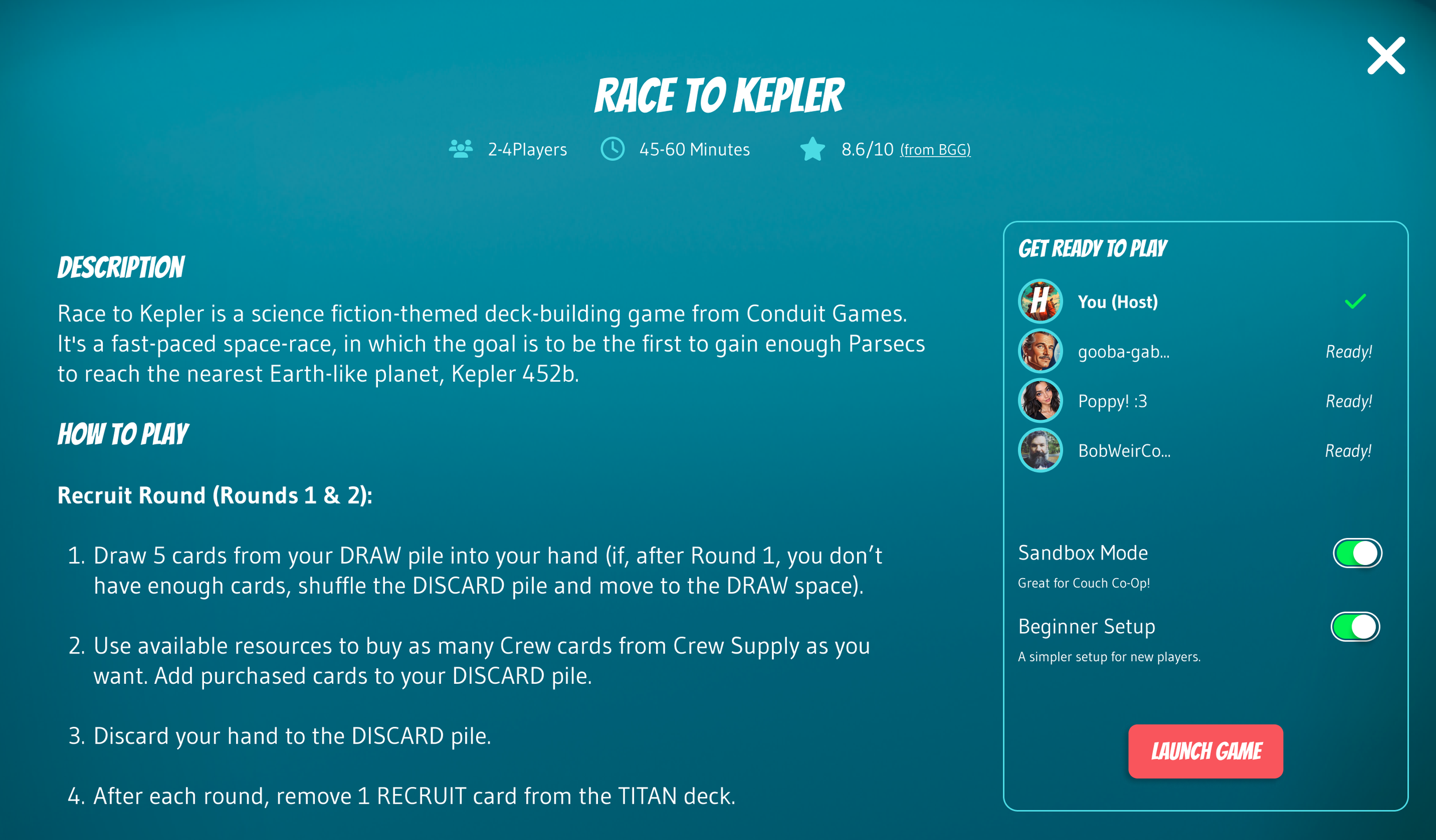
I led rapid design sprints to explore and test different approaches to onboarding, matchmaking, and game discovery. Each iteration got us closer to a smooth, intuitive experience that could support both growth and retention. By launch, we had a platform with a unified brand identity, a scalable design system, and a clear user flow that made play feel effortless.
Above: I wanted to ensure that we embraced the social aspect of online gaming in addition to actual gameplay, and developed a roadmap for how to increase integration between the two as our platform progressed.
Below: I developed and tested several approaches to onboarding, including text modals and a little robotic mascot named Moppy. I finally settled on a progressive disclosure model that taught players about the platform by having them do small tasks.
The Result
Merchants of Play emerged not just as another product, but as a cohesive ecosystem for digital board games — one that reflected both the company’s ambition and my leadership in guiding it there.
As the sole designer, I wasn’t just creating wireframes or polishing UI; I was setting direction, bridging disciplines, and ensuring the team delivered a product that felt whole.
This project taught me how to guide a fully remote, cross-functional team from idea to launch, while keeping players at the center of every decision.
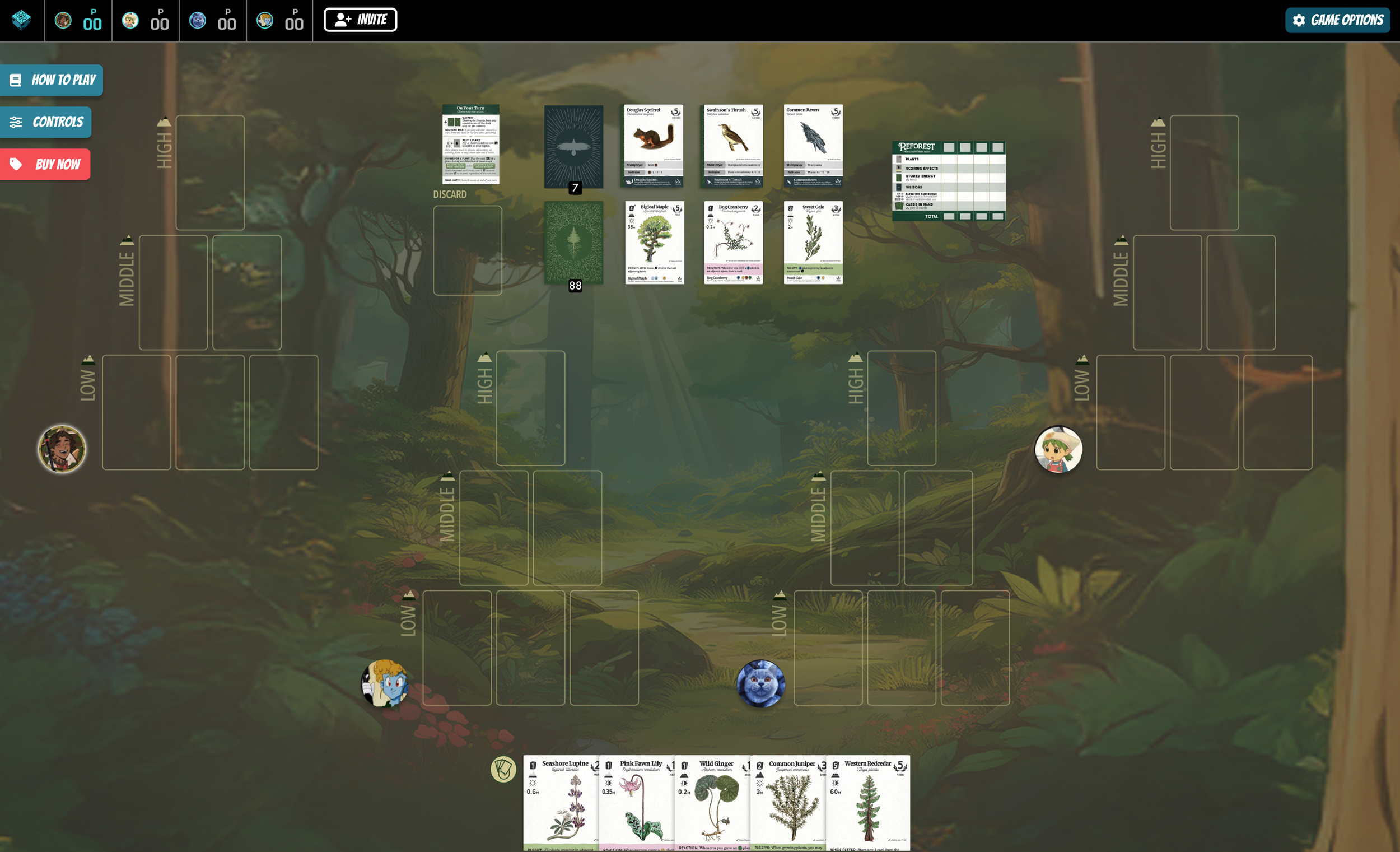
Below: The Merchants of Play activity is live and discoverable right now on Discord, and includes a thriving and ever-growing community of players from around the world.