B2B SaaS Platform
Client: Beauceron Security
Role: Principal Designer
Responsibilities: Design vision, IA, wireframing, prototyping, UX & visual design
Duration: 8 months (Oct 2025 - May 2026)
Tools:


The story begins…
I’ve spent a lot of time in my career as the only designer within a company, so this was nothing new. I was about to become the first designer in a developer-led shop, and relished the opportunity to reduce tech- and UX-debt. It would be a big task, but the work was already a part of my mindset. Establishing a design system, creating processes, writing documentation, and sharing best-practices from nearly 20 years of design.
Overview
Beauceron Security is a Canadian cybersecurity company founded in 2015. They take a people-first approach to their practice, identifying human beings as a company’s greatest asset rather than a security liability.
Team
I worked closely with CEO David Shipley, CRO Kathryn Cameron, as well as the product team led by Product Director Nicole Bendrich.
Goals
Allow security partners and MSPs to manage their customers efficiently and intuitively
Provide a first-class user experience that combined sleek UI and data visualization with a site structure that drives efficiency
Establish better processes to enable Beauceron’s teams to build more elegant solutions more quickly
Highlights
1,000,000+
End-users served
40%
Reduction in dev handoff time
100
Components created
Project Details
Background
Beauceron Security was founded in 2015 and has steadily grown as one of the leading cybersecurity companies in Canada. Their product was developer-led for the first 8 years of their existence, and as often happens with companies that initially prioritized development over design, they realized they needed to overhaul the user experience, highlighting a few inefficiencies in an otherwise popular product.
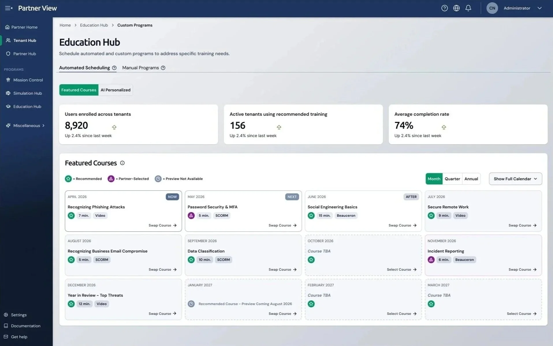
Initially built using Bootstrap, their platform is broken into three sections according to user groups:
1) Partner View: this section allowed partners, MSPs, and other channel partner managers to manage their clients’ accounts, set theming options, assign admins, and set other configurations
2) Admin View: where the bulk of training was organized and assigned. Each client had their own admin interface where courses would be assigned, phishing simulations would be created and sent, and where remediation plans and reports could be accessed
3) End-User View: this is the interface that most corporate employees have experience with. In this view a user can take mandatory security courses, see rewards they’ve earned, and check their overall security awareness.
First Steps
I began with a UX and heuristic audit of their existing systems, using the Nielsen Norman Group’s 10 Usability Heuristics standards. I went through each experience in detail, highlighting what I found and prioritized them according to level of risk. I then created a plan for how we could address the most immediate issues without disrupting the user’s workflow.
In addition to the UX audit, I also conducted interviews with Beauceron’s sales and customer success teams to find out what the most common pain points were for their users. When I overlaid my findings from the interviews on the results of the audit, it was easy to see the root cause of their frustrations.
Data Becomes Evidence
To gather more and deeper insights, I evaluated two data analytics tools: Mixpanel and Amplitude. While the interface of Mixpanel was more user-friendly, we ended up using Amplitude for the depth of data that we were able to retrieve.
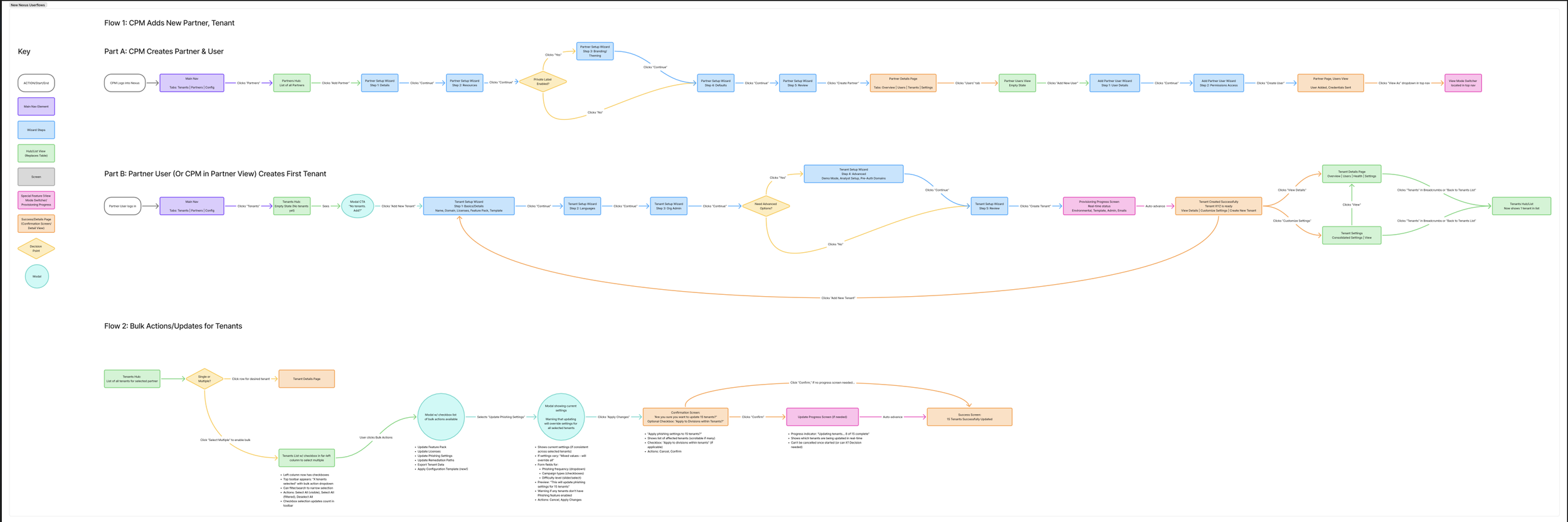
Creating a Blueprint
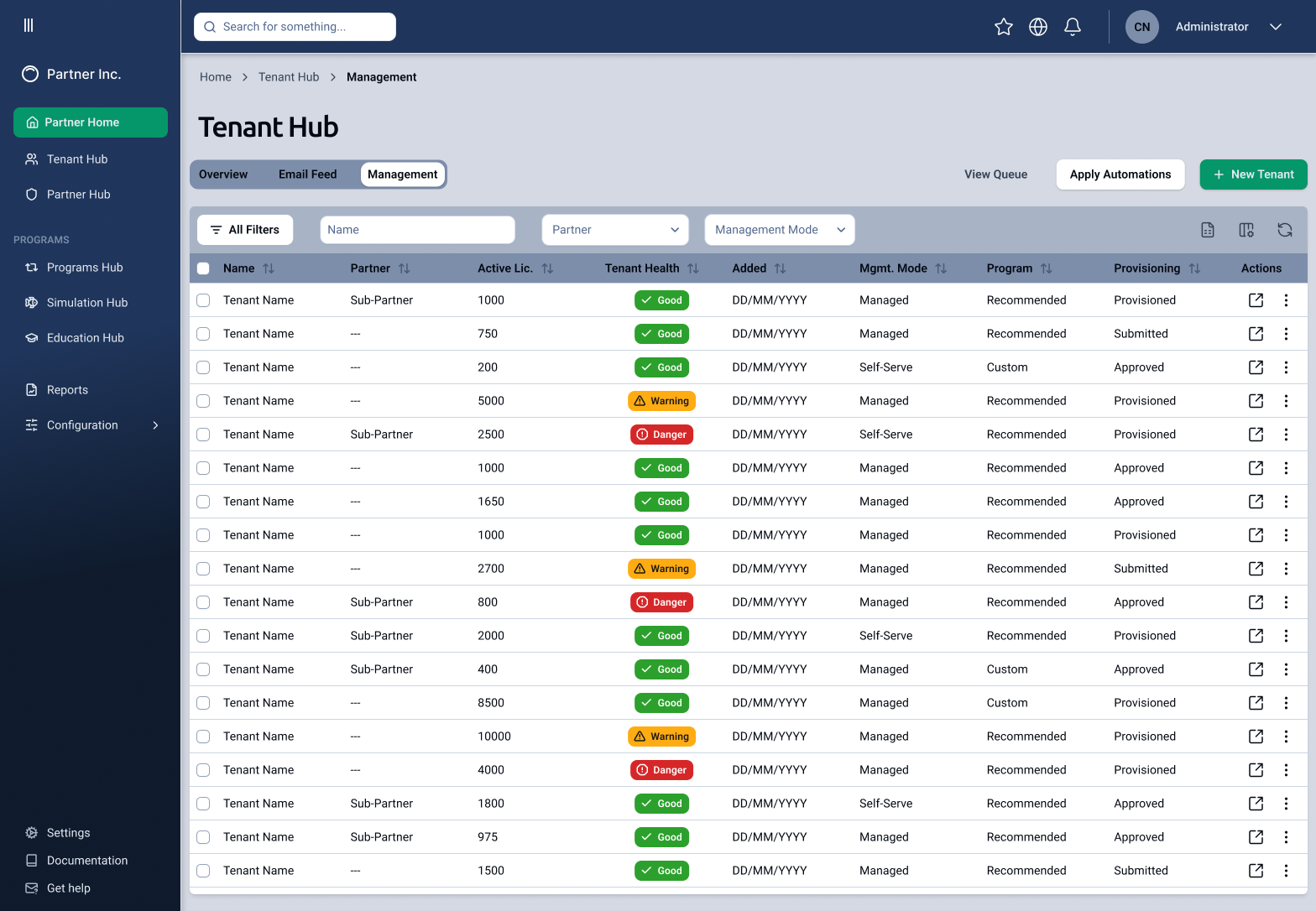
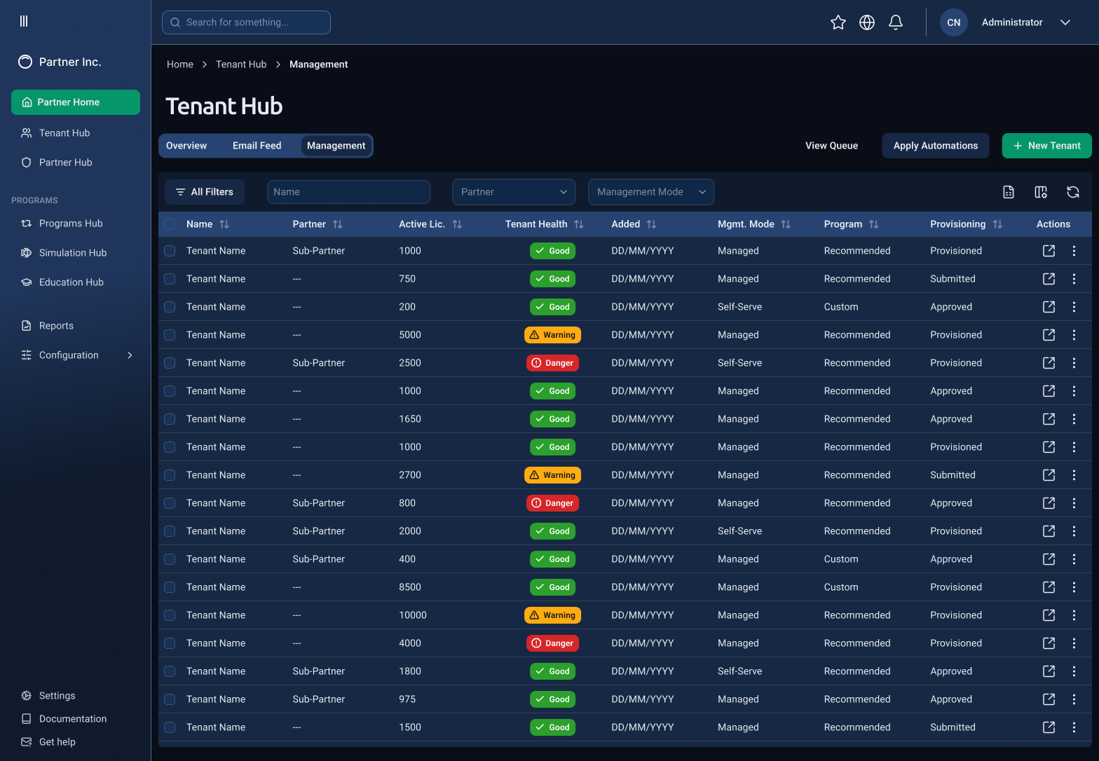
Using my findings from my UX audit, I created a user flow for the existing system. This highlighted the confusion inherent in both the user’s workflow and the data itself, which occasionally found itself inaccessible at a dead-end; for instance, two pages might share the same name, but one might be editable while the other was read-only.
Drawing on my experience with information architecture and hierarchy, I laid out a new structure that would group similar tasks together by audience rather than by task type. Both the product and development teams agreed that my structure cut a great deal of repetition from the user’s workflow, and so while I started fleshing out rough concept sketches, the dev team set about creating a new structure to move the data into.
Left and Above: The initial site organization and structure was built around specific tasks, resulting in a very full navigation menu and sub-menu. By changing the structure from “what micro-task am I doing?” to “who is this affecting?” I was able to simplify the architecture considerably, greatly reducing friction for admin users.
Crafting a Visual Identity
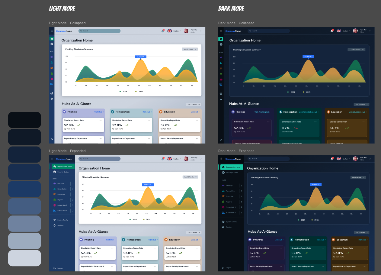
Around that time I also began exploring options for the new platform’s visual design and colour scheme. I strongly encouraged the team to implement dark mode, and it quickly became a shared priority. I set about developing general colour guidelines to show how I envisioned modern system colours sharing space with bold data visualizations.
Time to Build
We realized early on that time would be of the essence. We had a deadline of overhauling Partner View by July, and we knew there would be other partner-specific work coming our way. This meant we wouldn’t have the luxury of creating a truly custom visual design from scratch.
I knew the team already had experience working with an established framework, and also that they wanted to build in .JS. I knew we needed both a design system and a counterpart pattern library, so I researched some options including Material/Angular and shadcn, and ended up choosing the latter.
Shadcn was the right choice because:
It’s built on React, which the entire team agreed was the right framework for us to utilize
It wasn’t as visually recognizable as a more established system like Material Design
It allowed our team more flexibility to modify or combine components as our needs evolved
Shadcn includes a Figma UI kit, complete with documentation, that I could use to get a head start. This allowed me to focus on customizing existing components rather than building them from scratch
We were able to build more quickly and effectively, while also maintaining strong consistency and cohesion between design and development.
I also knew a common design ethos would be helpful for the team to refer back to. This would allow us to minimize decision roadblocks by giving the dev team some basic design guidelines to fall back on. I wrote the Beauceron Design Vision with input from both David (CEO) and Nicole (Director of Product), and it was shared with the rest of the team. The document served as general design sensibility guidelines rather than a spec, and communicated the vision richly without being overly prescriptive.
Above: The company’s original component library was grouped by use case, which meant that every time a new use case was identified, a new component was created. I identified seven core components, and then compiled them into groups according to Atomic Design. This not only streamlined the library, but also helped the team more readily understand how complex Shadcn components were built.
Working with AI
Each person on our team was given their own AI account. I used it as a sounding board for design iterations, pressure-testing decisions against NNg principles and industry best practices.
I also quickly discovered how helpful its prototyping capabilities are; whereas in previous projects, the wireframe phase often took weeks of iteration and discussion, with AI I was able to create a semi-functional wireframe prototype to not only show layout, but also interaction.
I frequently met with the CEO and CRO to listen to their ideas and translate them, on the fly, to a design they could actually test and socialize.
Within a few days we had a solution that not only reduced friction for our users, but also was accessible and met all 10 of the NNg Usability Heuristics.
As more AI-based tools became available, the product team and I, along with the CEO, were able to refine design concepts even more quickly.
Other AI tools helped me to work faster, such as Figma Make, which allowed me to drop in the design system and have the agentic tool create designs using our own components and tokens. Other customizations like the Figma MCP and Claude Code allowed me to streamline my work by enabling a more direct flow from Figma to our codebase.
Challenges
I collaborated closely with executives in the C-Suite, listening to their needs and requirements and reflecting them back as visual designs. Working within a founder-led organization meant learning to translate vision quickly and advocate for users at the executive level.
This extended to client-facing work as well; I led weekly design reviews with an enterprise client, a Big Five Canadian financial institution, walking their stakeholders through concept sketches, wireframes, and final designs, and incorporating their feedback into each successive iteration.
Another challenge arose in consistency. Because the dev team was being urged to build faster than the designs were finalized, some pages required rework once the true solutions were decided upon. I set up a daily “design huddle” to establish a regular design QA cadence. This way, design inconsistencies were caught before their individual branches were merged into the codebase.
Outcomes
The processes and design infrastructure I provided allowed the team to reduce our handoff by 40%, increase our consistency across Partner View, created their first design language, and iterate rapidly on brand new experiences and new features.