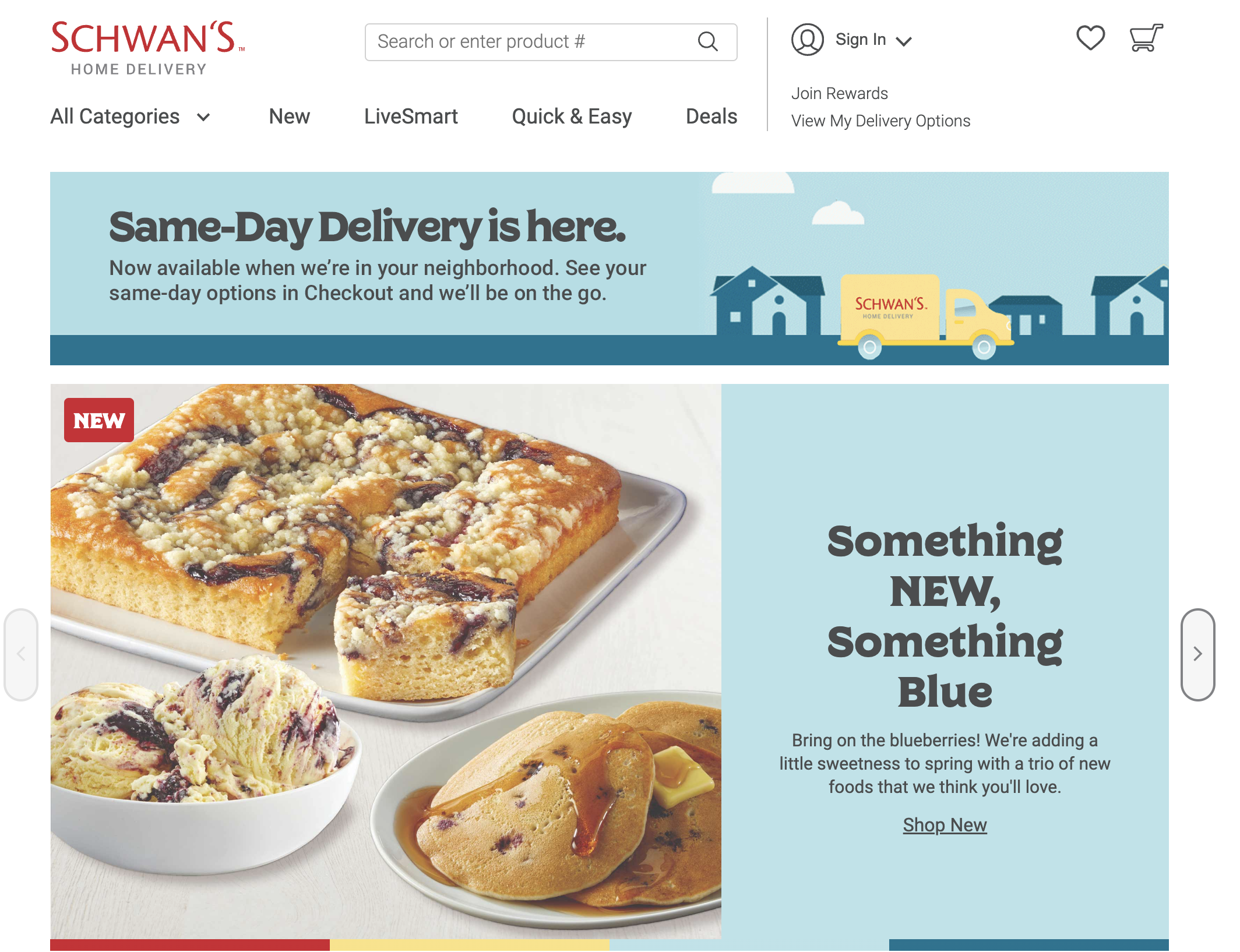
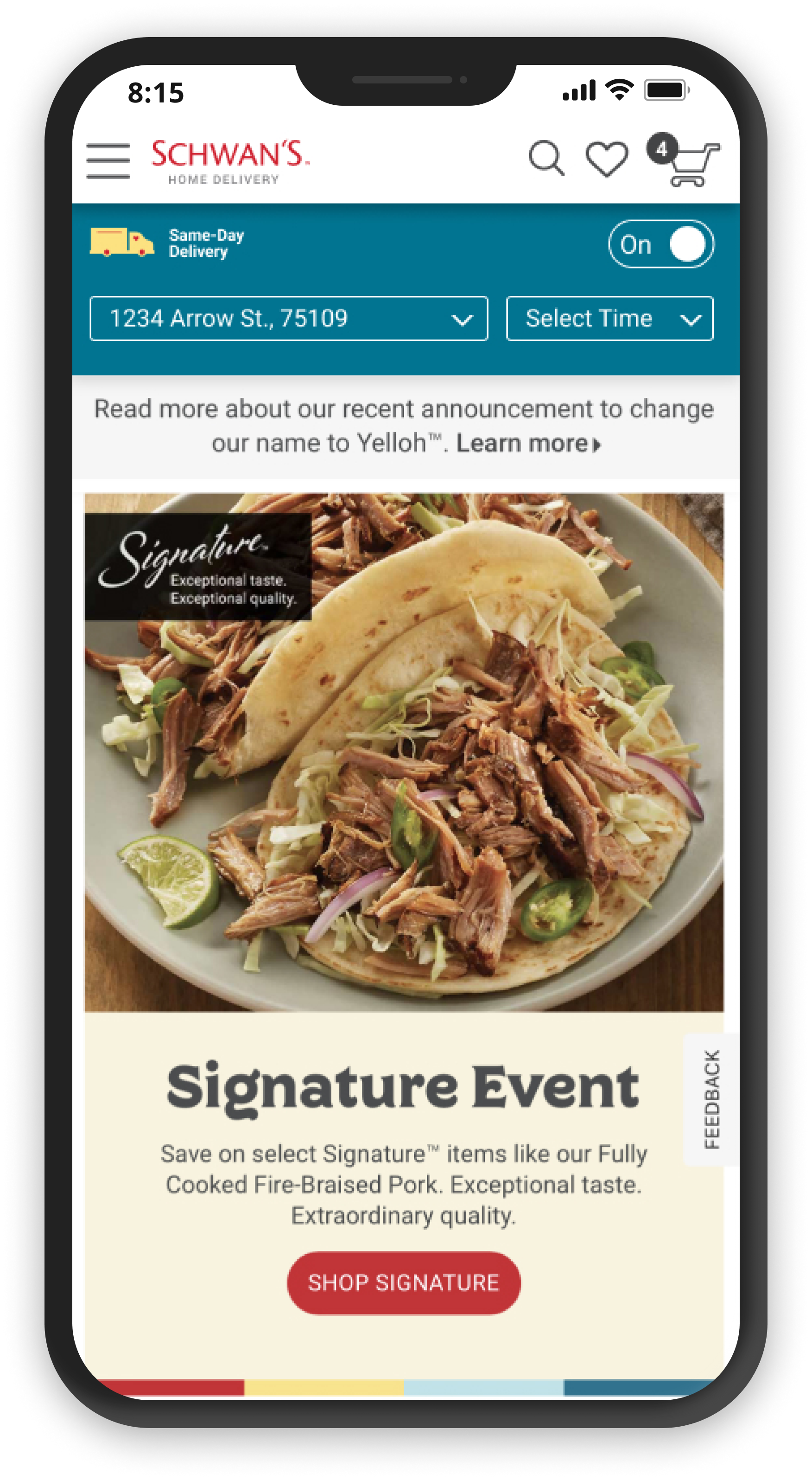
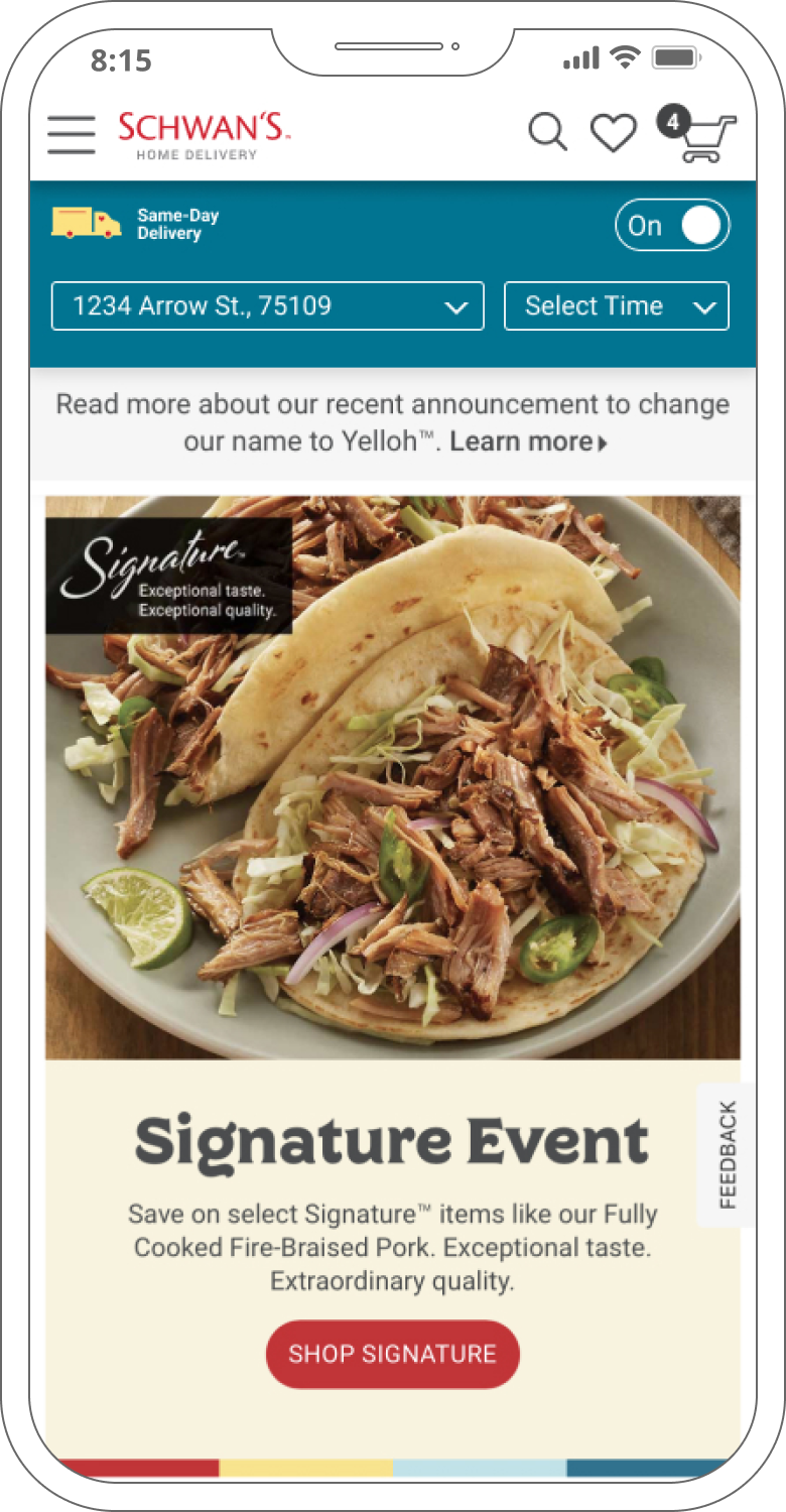
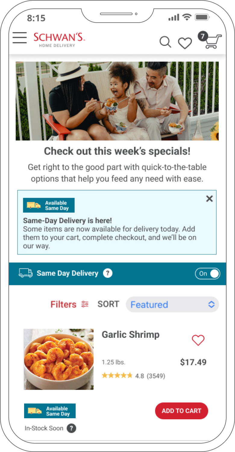
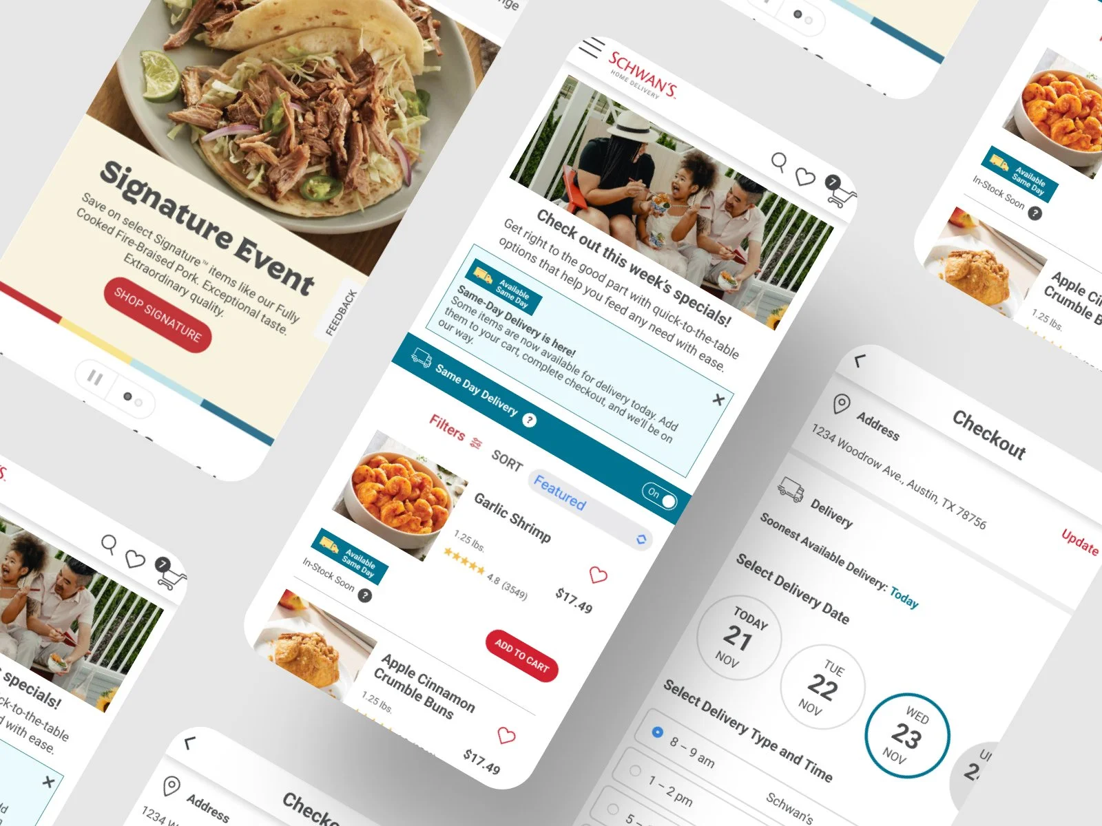
Same-Day Delivery
Client: Yelloh! (formerly Schwan’s Home Delivery)
Role: Lead Product Designer
Responsibilities: UX/UI design, user flows, wireframing, prototyping, visual design, user testing
Duration: 1 Year (Apr 2022 - Apr 2023)
Tools:

The story begins…
“Do you mind jumping right into a project on your first day?” Tanner had asked. I told him I didn’t mind at all, and that I was excited to hit the ground running. I had just joined Bold Orange as their Senior UX/UI Designer, and they already new I could be counted on to deliver.
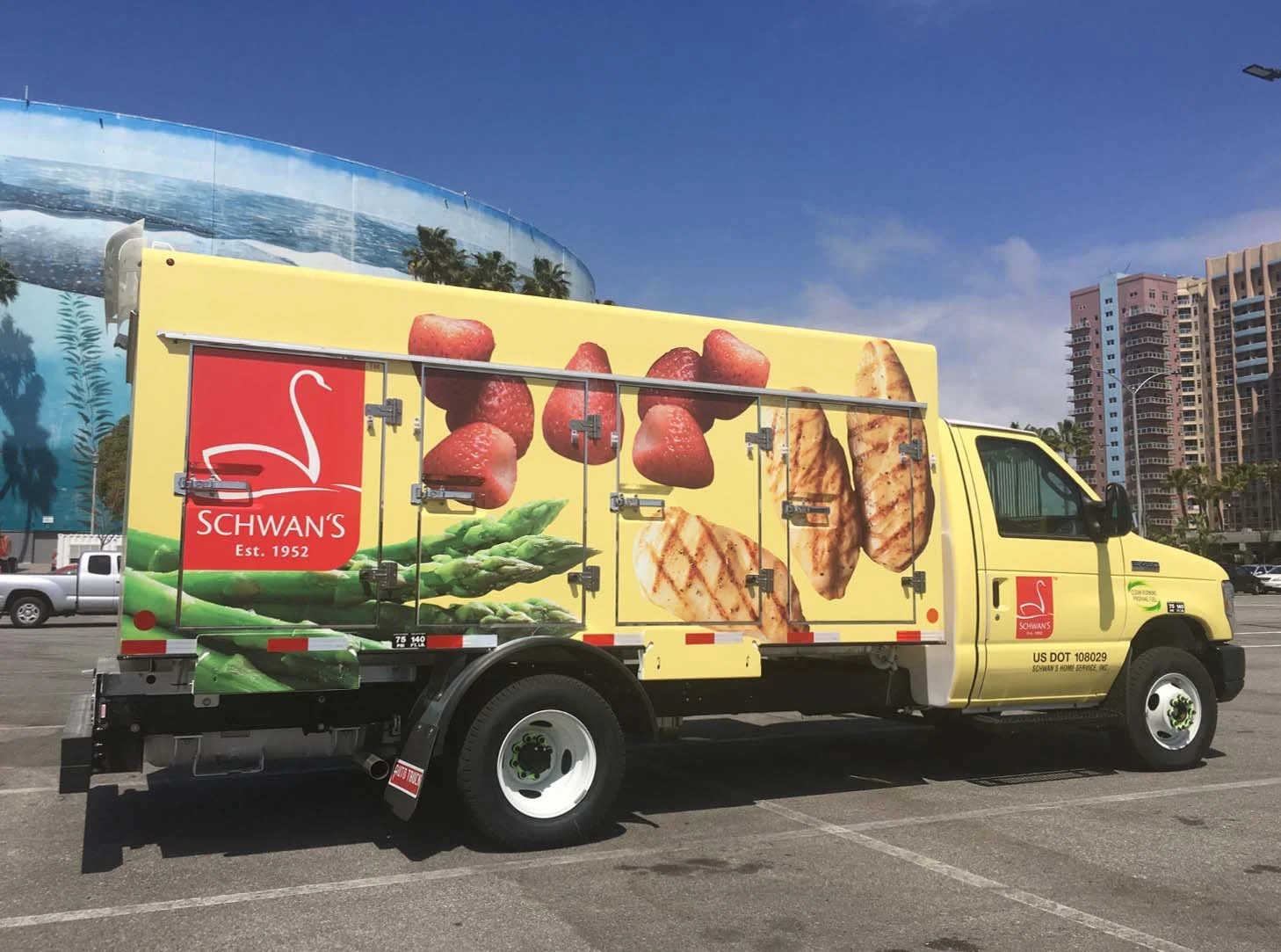
We all knew the familiar yellow trucks the client had used to deliver ice cream, pizza, and other frozen foods throughout suburban and rural Minnesota; they were iconic, and for many of us they were a staple of our childhood. And now they desperately needed our help…my help…to stay relevant in an age where speed and affordability held a higher premium than friendly and personalized customer service.
But it wouldn’t be until I got well into the project that I saw just how much help they needed.
Overview
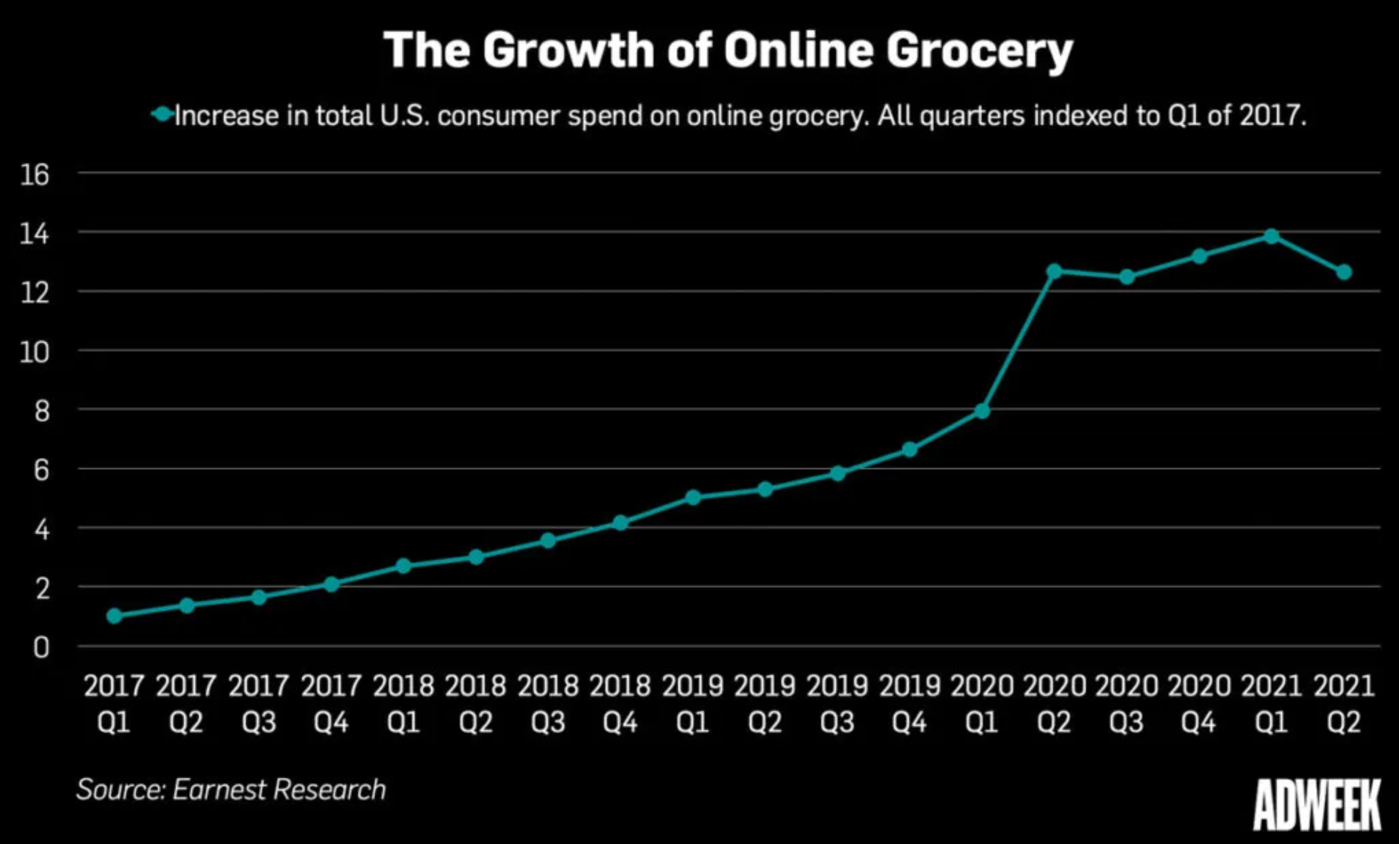
Yelloh.com (formerly Schwan’s Home Delivery) is an online retailer of high-end frozen foods selling direct-to-customer. They’ve been operating since 1954 and became a household name thanks to their world-class customer service and yellow delivery trucks delivering food to users in rural parts of the country. While they’ve been in the e-commerce space since the early 2000s, they lacked same-day delivery options. Thus, after the Covid-19 pandemic hit in 2020, they found themselves losing large numbers of customers to competitors with more rapid delivery options.
As a senior product designer with Minneapolis-based agency Bold Orange, I was embedded in their product team to lead design of this new feature for them. In addition to adding same-day options, I also helped implement a streamlined checkout flow and other UX enhancements that brought the entire user experience up to a new level.
Team
Courtney Beyer (Product Owner), Hope Doom (BA), Jim Bittner (Scrum Master), Shawn Ricketts (FED), Robert Bogenheimer and Paul Griebel (Back-End), Bijoy Jacob (Middle-Tier)
Goals
Allow users to place same-day delivery orders
Increase user engagement with the e-commerce website and mobile app
Identify other trouble spots and suggest or design solutions to ease friction
Highlights:
22%
Reduction in abandoned carts
18%
Boost in conversions
$56
Average increase per order
Background
Schwan’s Home Delivery, an innovative, family-run retailer of frozen luxury foods since 1954, built its entire business model on the concept of regularly scheduled deliveries. The iconic yellow trucks (which served as the inspiration for their rebranded name) would travel down neighborhood streets across America, with the drivers going door-to-door offering frozen goods right off the truck. For decades, Schwan’s delivery drivers were highly-regarded by their customers, with many families including them on Christmas card lists and birthdays. Loyalty had been earned by the building of relationships.
But now that loyalty was being challenged in the face of a global pandemic.
Project Details
The Problems:
As technology advanced and online and mobile ordering took center stage, Schwan’s struggled to keep up. During the early Covid-19 pandemic, the rapid rise of competitors such as Instacart, Shipt, and others who offered same-day delivery cost Schwan’s millions of dollars in revenue. The company had roadmapped a version for this type of feature for their website and mobile app, but hadn’t prioritized it until it was too late to get ahead of things.
Discovery: “Getting to know you, getting to know all about you”
I started by diving into their existing research to learn more about the people I would be designing for, their values, needs and desires. Research showed that abouty 70% of the users were mobile users, so it was crucially important for me to make sure we led with a mobile-first mindset. We also learned that 53% of users were rurally located, and a majority were women between the ages of 35 and 70.
With a firm understanding of who we were designing for, my Bold Orange partner Tanner and I began mapping and sketching out the existing checkout flow and looking for the most natural and intuitive entry point for same-day functionality.
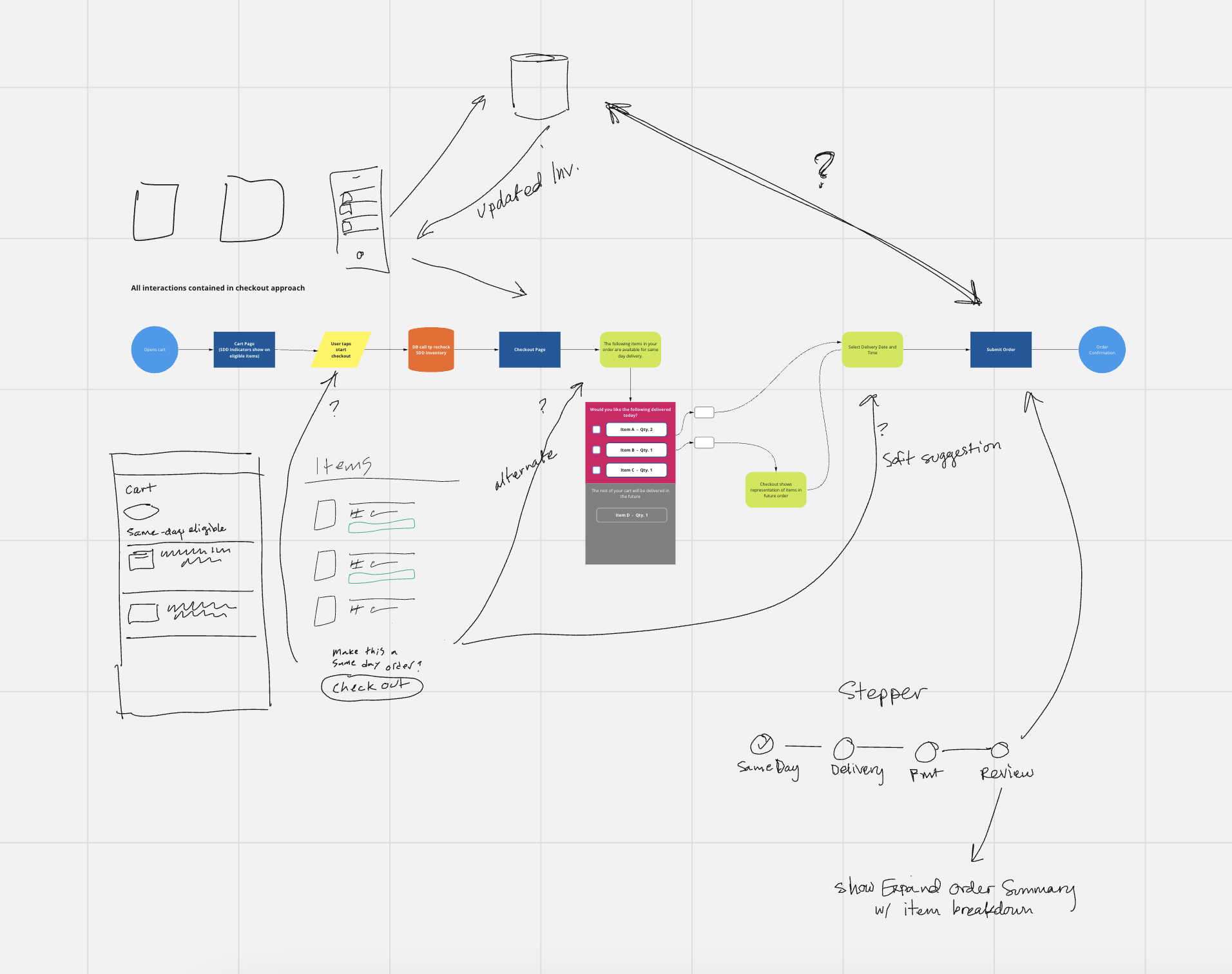
As with previous clients, I decided to stick with hand-sketches and illustrations for the initial presentation of our design strategy to the product team. Tanner and I each took a section of the experience and sketched it out, with me focusing on a visual service blueprint that overlaid the necessary data transfers on top of a user flow.
Taking a pause to recalibrate
Then the project stalled. I didn’t immediately understand why, although I found out soon enough when Bold Orange’s Chief Experience Officer called me.
“So, Schwan’s really likes you. They’re really happy with what you’re doing.”
I waited for the shoe to drop.
“But…” There it was. “They’ve run into some snags with the supply chain and are trying to figure out some operational stuff. They had a bad Q2, and now they’re pulling back on everything we’re doing with them. Everything, that is, except you. They want you to keep working with them, because they’re really happy with what you’ve done so far. But you’ll basically be a full-time part of their team now."
“I can definitely do that,” I replied. “I’ve got a lot of experience as the sole designer.”
“I know, which is why I know you can handle it. Just make sure that you’re always bringing value no matter what.”
So while SDD-specific work was paused, I continued to provide design support for BAU (Business As Usual) and other feature work. It was during this time that I helped them revise their internal processes by creating and implemented their new design system, as well as transitioning and training their marketing design team from Photoshop to Figma.
Deeper Discovery: Working around tech debt
In September of 2022, we received word that we could now resume our work on SDD. But we had one main constraint to work around first.
Key Problem: Because of their outdated and limited front-end framework, I knew we wouldn’t be able to implement a truly modern same-day solution right away. So I had to get creative with how we could add a new feature that would provide the needed functionality and fit within the constraints of the framework.
Solution: I suggested that we release the feature in phases. This would allow us to provide a Minimum Functional Product to get users onboarded to SDD while we continued to develop and increase our capabilities on the product side.
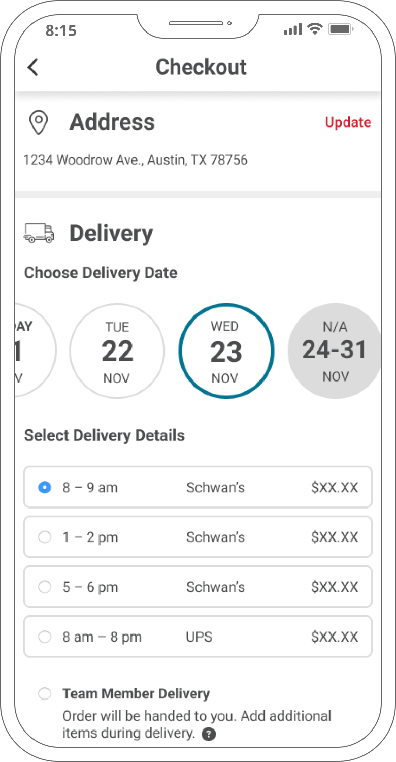
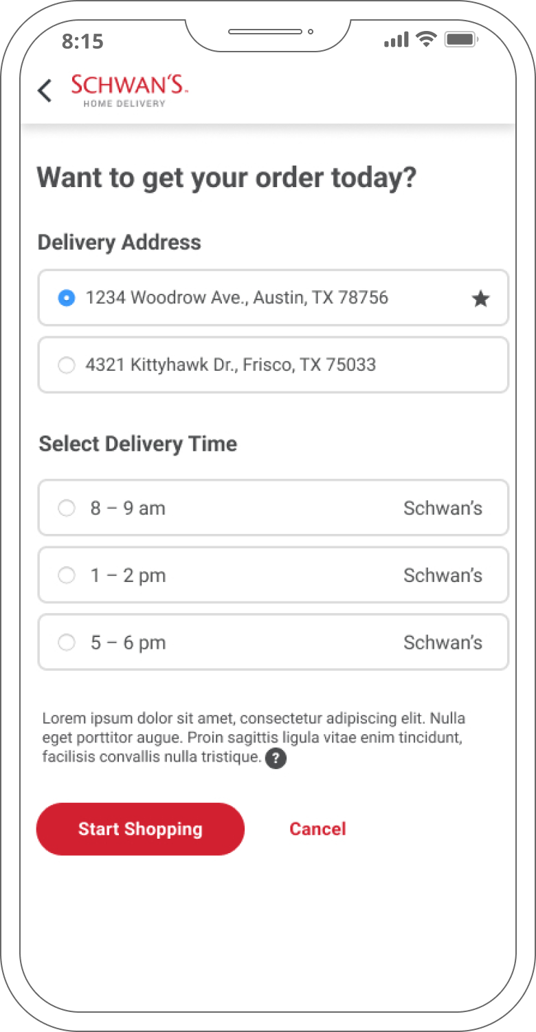
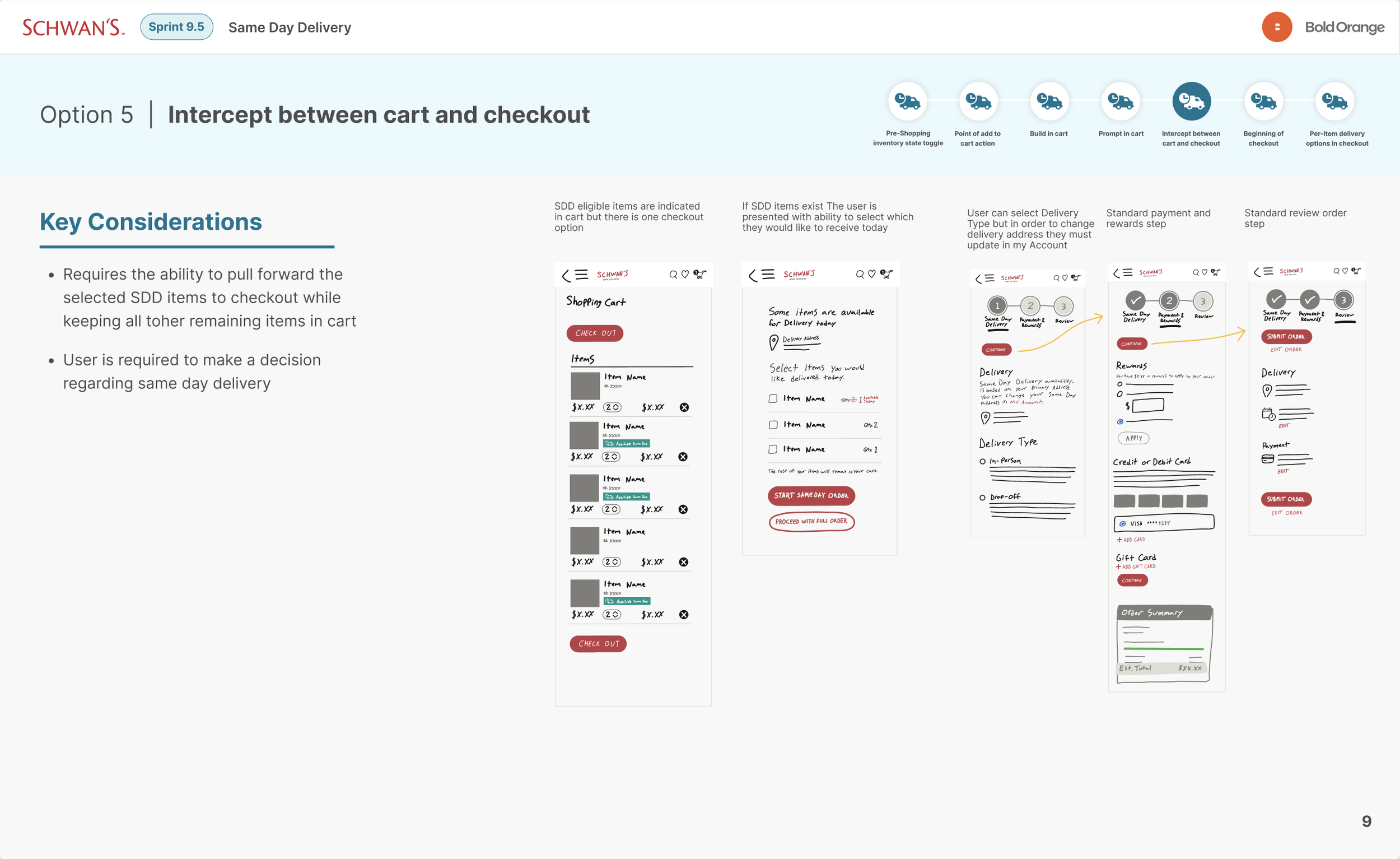
Phase 1 would be unveiled to customers in select locations, and allowed them to add items to an existing, scheduled delivery as late as the morning of. While not a “same-day” feature in the same sense as Instacart, it was a big step in the right direction.
Phase 2 was a broader, more traditional (although still somewhat limited) same-day model with expanded UI options. Users across the country could start a new order, select a delivery time for later in the day, and expect their items on time.
Phase 3, which ultimately ended up being shelved due to more operational and financial challenges, would be a typical same-day delivery feature competitive with those of major retailers.
Doing the best we could with what we had, where we were at.
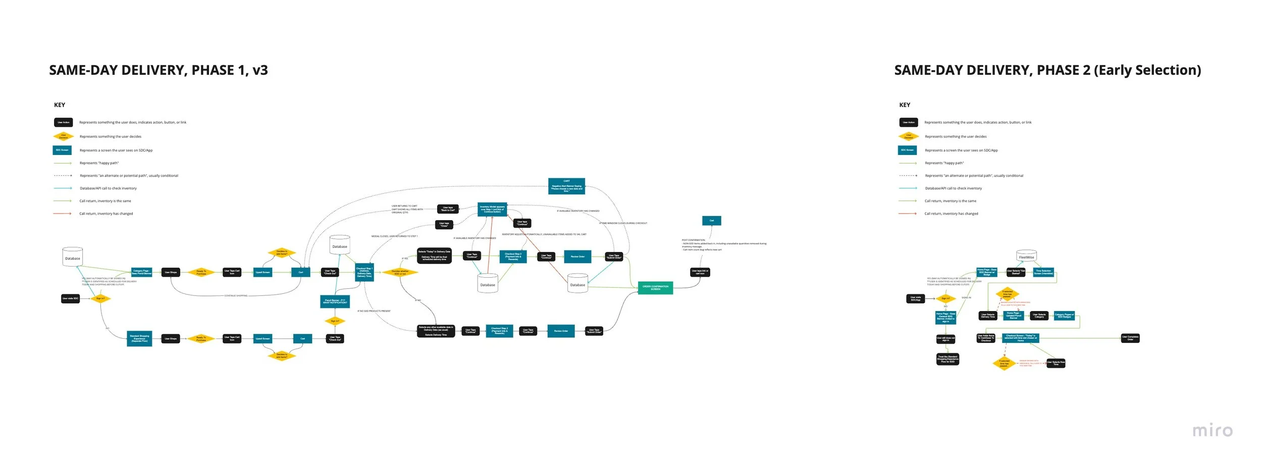
I began by mapping out the user flow, incorporating the additions from our sketching exercises. I created this in Miro, and regularly met with the product owner, business analyst, front-end developer, and back-end engineers. During our collab sessions we expanded upon the service blueprint I’d sketched out during the Discovery phase, and we identified every API call that occurred between the mobile app, database, and the handheld devices used by the delivery drivers.
Wireframes: Building the solution’s frame
Key Problem: How do you incorporate a new feature into an existing flow without disrupting that flow? I wanted to be careful with where we merged these paths, since Schwan’s users had been accustomed to a particular flow for years. However, we knew there were some things that needed to be improved, like Checkout (with which we noticed a growing number of abandoned carts). But I wanted to make sure that we did so mindfully.
Solution: I decided to add two soft entry points: One at the beginning, and one at checkout.
In researching the customers’ use patterns, I knew that many users stay logged in to their accounts and wouldn’t necessarily begin their shopping journey from the homepage. Checkout was the natural checkpoint for everyone, so it made sense to put an opt-in there as well as on Home.
During the wireframing phase I scheduled regular design reviews with the product owner and FED to catch any potential issues before they became solidified in the design.
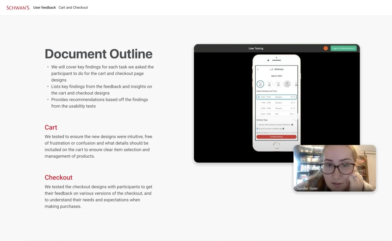
One of the tools I leveraged to provide early validation was prototyping the wireframes. This allowed us to test rapidly for specific use cases and interactions. Because Schwan’s didn’t have much budget for user testing, I often conducted my own “guerrilla” user testing with my friends and co-workers. Findings from our testing results were then discussed within the team and applied to the designs.
UI & Visual Design: An exercise in “fresh familiarity”
By this point I’d created a robust and scalable design system for the company, and I was able to rapidly assemble the UI for this experience. Since the SDD process largely existed alongside other pages, I was able to refer to the wireframes and service blueprints to efficiently and seamlessly blend the two experiences in one natural flow.
I laid out my flows carefully, adding contextual notes to fill in the gaps that naturally formed with static designs. These notes addressed user intentions, actions, and feelings, as well as functionality notes for the FED.
New UX enhancements: Compounding improvements for user ease
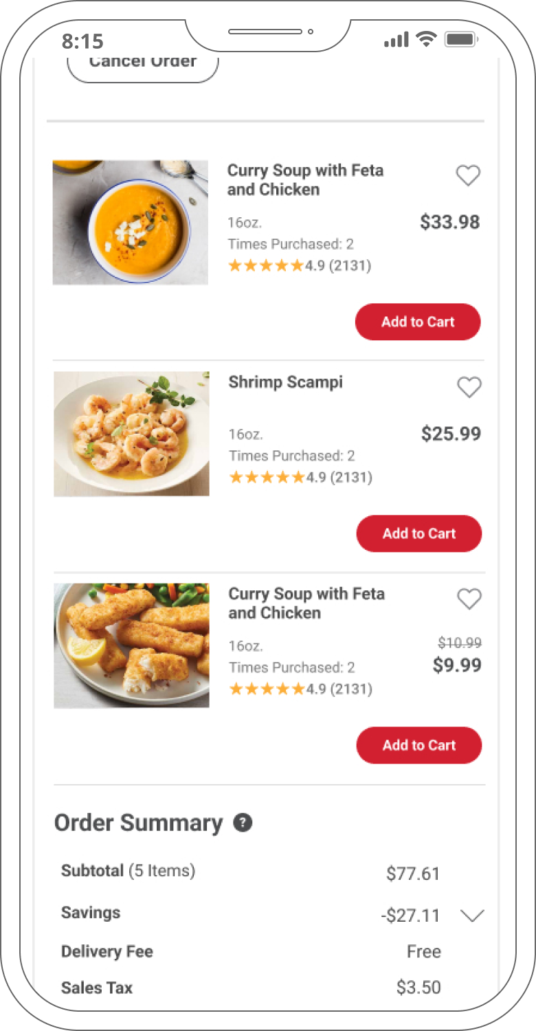
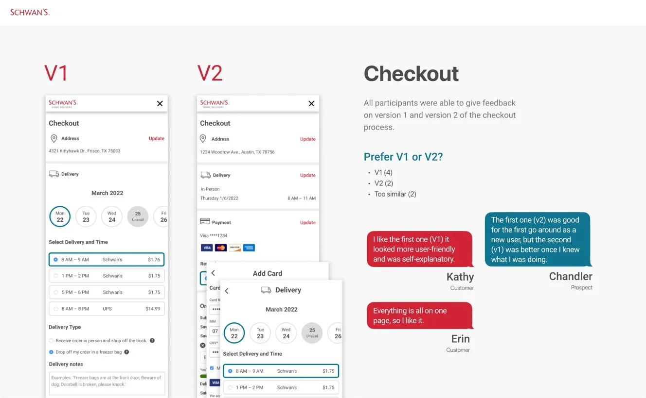
In addition to the same-day delivery feature, I led the redesign of the checkout process which increased efficiency, integrated EBT payment options, and added other small updates to enhance the user experience.
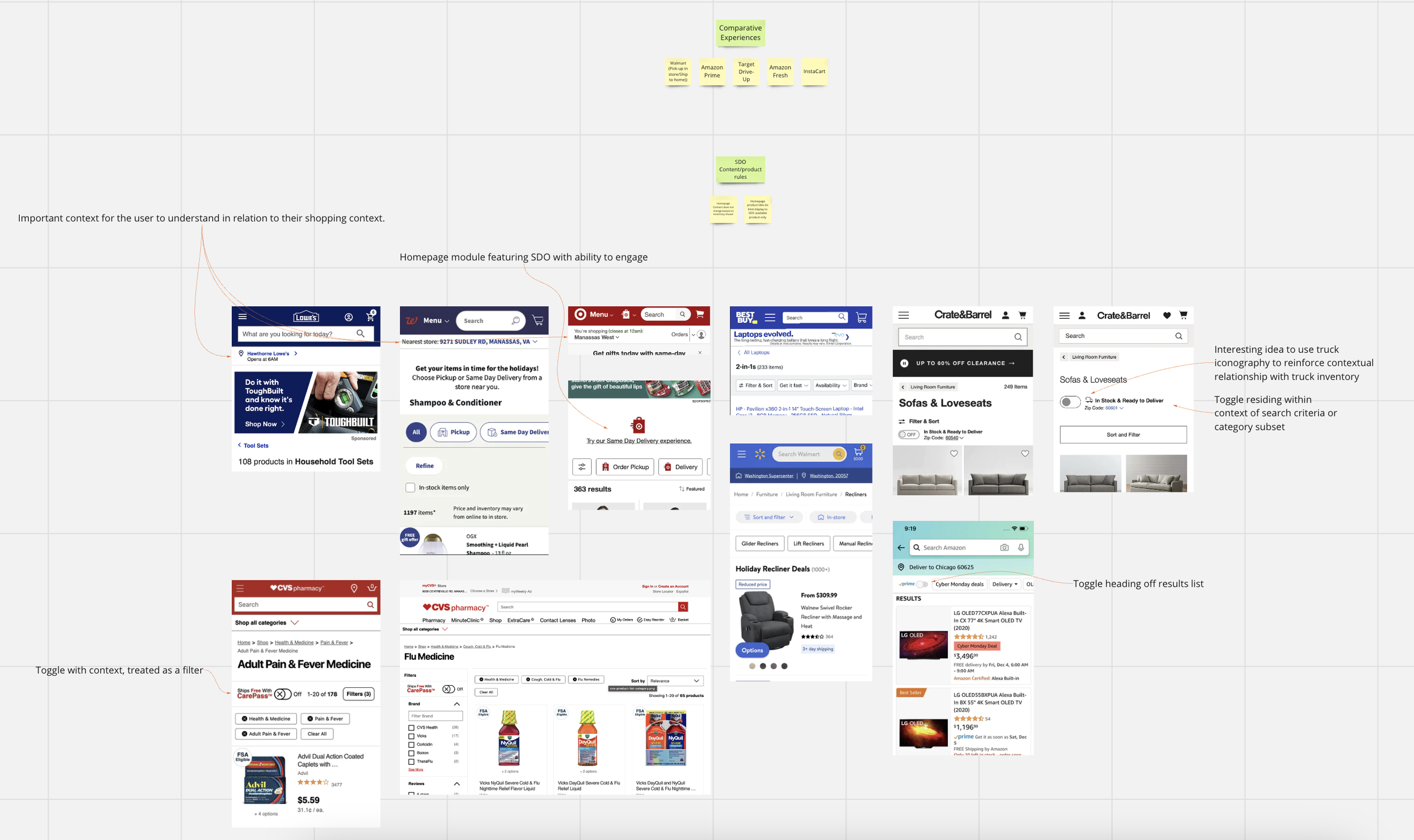
Key Problem: Users felt that spreading the experience over multiple steps was tedious and sometimes confusing. Competitive analysis showed that other e-commerce retailers frequently combined delivery, payment and rewards in one continuous experience, which had a big impact on overall conversions and engagement.
Solution: We combined Schwan’s four-step checkout process into one flexible screen that greatly reduced friction.
Discovery and initial design explorations had been done prior to my joining the team, but the updates had been put on hold during the company’s operational pause and pull-back. I picked up where they left off and continued to develop the ideas and designs.
Validation: Testing our hypotheses
As with the wireframes, I built prototypes that we could use for user testing. I worked with the team to develop a script, and a list of customers was compiled by the marketing team, which conducted the testing sessions.
Our sessions revealed that users found both the same-day and checkout flows to be intuitive and efficient. This information was compiled into a deck to share with stakeholders outside of our product team.
Outcome & Takeaways
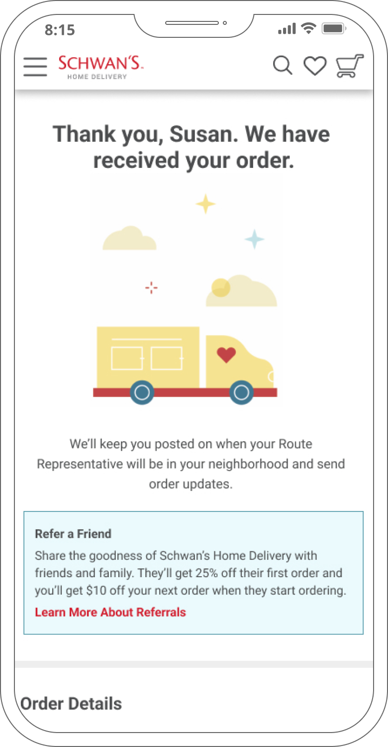
In April 2023, the same-day delivery feature was successfully launched to the general public on both the website and mobile app, marking a significant milestone in the company’s long-term goals. Within the first month the company saw an overall increase in user engagement with the site and increased and marked a 22% reduction in abandoned carts during checkout. Conversions went up 18%, and orders averaged a bump of $56. Customers also ordered more frequently, as they no longer had to wait two weeks for their scheduled delivery dates.
The release wasn’t without its challenges, however. Because of national supply-chain issues, distribution centers around the country struggled to keep up with demand, and a number of products remained out-of-stock. This caused frustration for many customers, and in the long run Schwan’s (which had, by this time, rebranded as “Yelloh!”) saw a drop in engagement from users who chose to go back to Instacart for their more immediate grocery needs.
Takeaways
A feature can be functionally robust and provide a wonderful experience, but if the merchant can’t support it from an operational standpoint, keeping users will remain a struggle.
Tech debt needs to be addressed on a continual basis, as once an organization gets over their head, eliminating it becomes exponentially more difficult and expensive. If we’d had a modern, flexible front-end framework to work with, we would have been able to implement a competitive same-day solution as our Phase 1 approach.