Same-Day Delivery & Streamlined Checkout
Client: Schwan’s Home Delivery/Yelloh!
Role: Principal product designer
Responsibilities: Design leadership, research, UX/UI design, prototyping, user testing, design QA
Overview
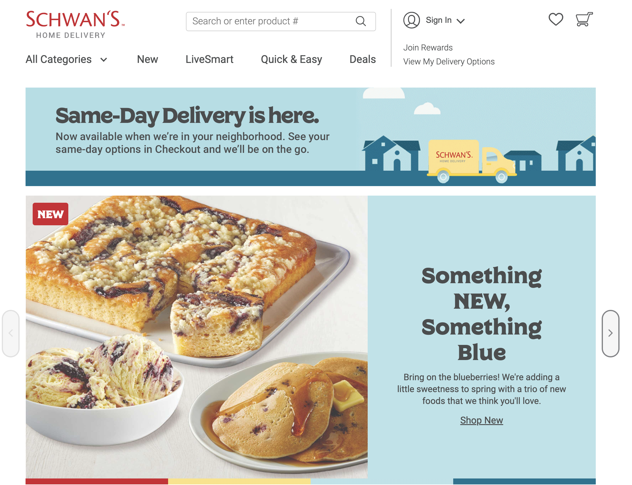
As the Lead Product Designer, I embarked on a project to create and implement a same-day delivery feature for Schwan's Home Delivery, later rebranded as "Yelloh!" The company had intended to add this type of feature for several years but had never gotten around to it. During the early pandemic, the lack of such feature caused the company to lose customers to competitors such as Instacart, Shipt, and others who offered same-day delivery. In an effort to catch up to the competition, Schwan’s decided to produce their own version.
The release of Same-Day Delivery, coupled with redesigning the checkout process, ended up raising user engagement and reduced abandoned carts by 22%.
Same-Day Delivery
Schwan’s had conducted user research prior to me beginning work on the Discovery phase of this project, and that helped inform the approach we took. I started by reviewing and studying their existing research to understand their users’ needs and desires. With a firm understanding of such, my team and I began mapping out the existing checkout flow and looking for the most efficient and intuitive way to introduce users to that particular path.
We worked together with stakeholders to make sure that our approach to solving the problem was thoroughly researched and based in documented evidence as opposed to unfounded assumptions.
I looked at the experiences of other online retailers who offered similar rapid shipping options and incorporated the findings into our own solution. In order to ensure that stakeholders and our team sought solutions and not get hung up on design choices at this early stage, I chose to sketch out concepts by hand as we worked out the different moving parts.
Once the team agreed on our approach, we presented to the stakeholders and got full approval to move forward.
At this point I created a service blueprint to map out both the user experience as well as the technology behind it, which the team used as a guide to determine where to place the different APIs and system calls that would power the feature.
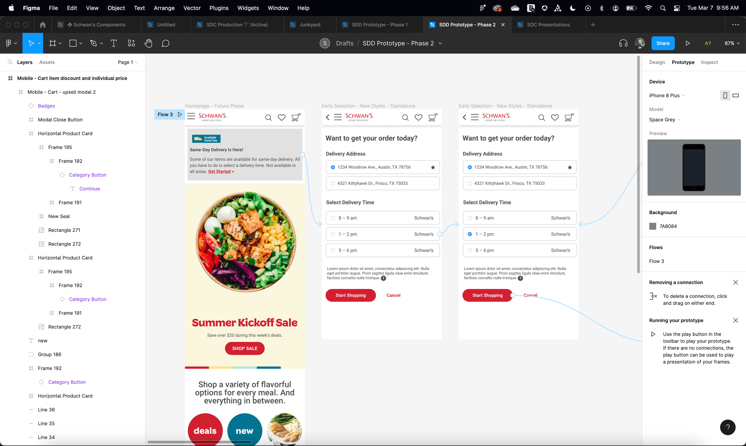
Once we understood the different flows that would take place simultaneously, I started laying out wireframes to identify those key user interactions and what those would look like. We went through three rounds of wireframe revisions before we landed on our ultimate solution.
The UI design phase took the shortest amount of time. Building upon existing user patterns, we were able to quickly arrive at a design that would prove most intuitive to users and allow the most efficient front-end development (another issue plaguing the team was an obsolete front-end framework that had been custom-built for them, but was not designed with future flexibility in mind, so developing new web components took twice as long as it would be if they were using something modern like Bootstrap).
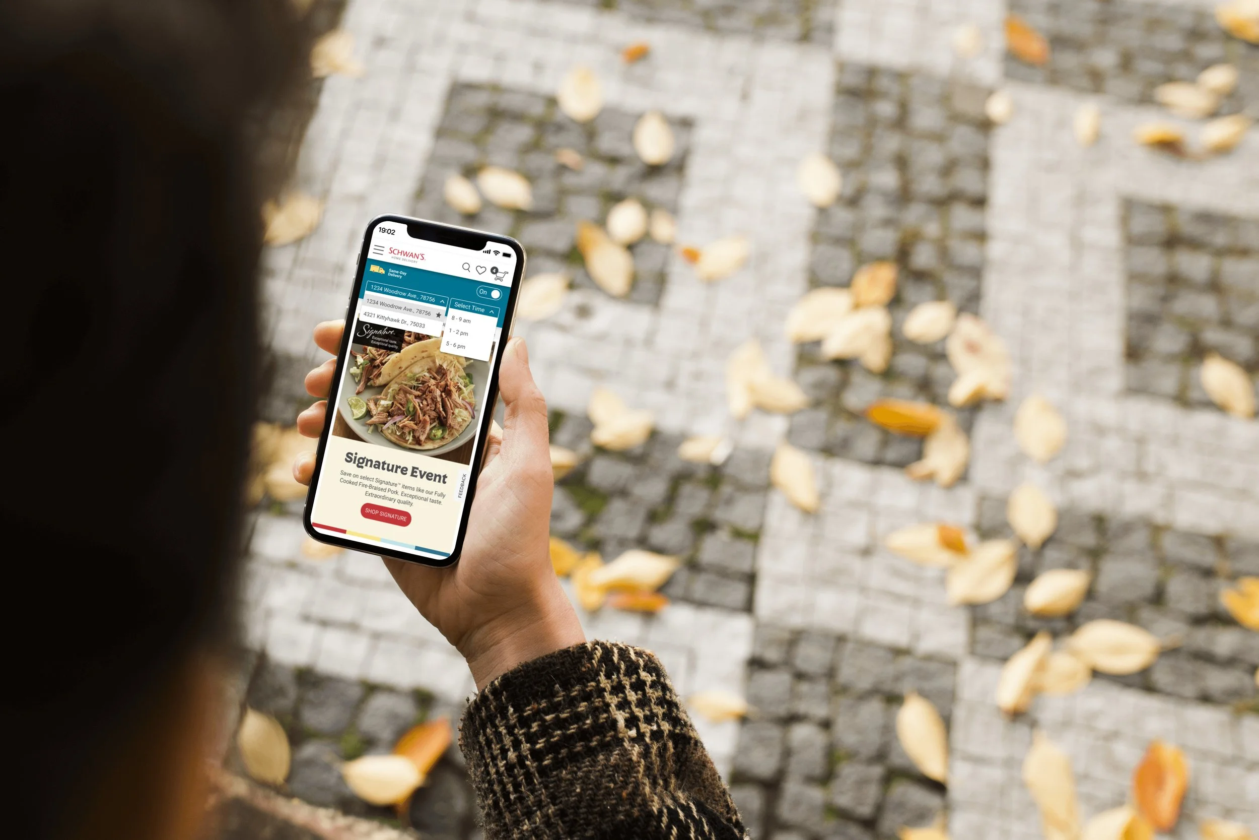
Because of this, we decided to build a prototype and do some user-testing. Users commented on the ease of use and how well the experience flowed alongside the normal shopping experience they’d been used to.
Schwan’s Home Delivery’s Same-Day Delivery feature was released in April of 2023. The company reported a 22% bump in conversions as a result of customers being able to get their orders on the same day, and 18% drop in abandoned carts at checkout.
Streamlining Checkout
Improved User Experience: In addition to the same-day delivery feature, I led the redesign of the checkout process for increased efficiency, integrated EBT payment options, and revamped the Recipes section of the website to enhance user engagement and satisfaction.
We began by conducting user research to determine frustrations and pain points within the existing checkout process. Users felt that spreading the experience over multiple steps was tedious and sometimes confusing. Competitive analysis showed that other e-commerce retailers frequently combined delivery, payment and rewards, and related screens in one continuous experience, so this informed our discovery as well.
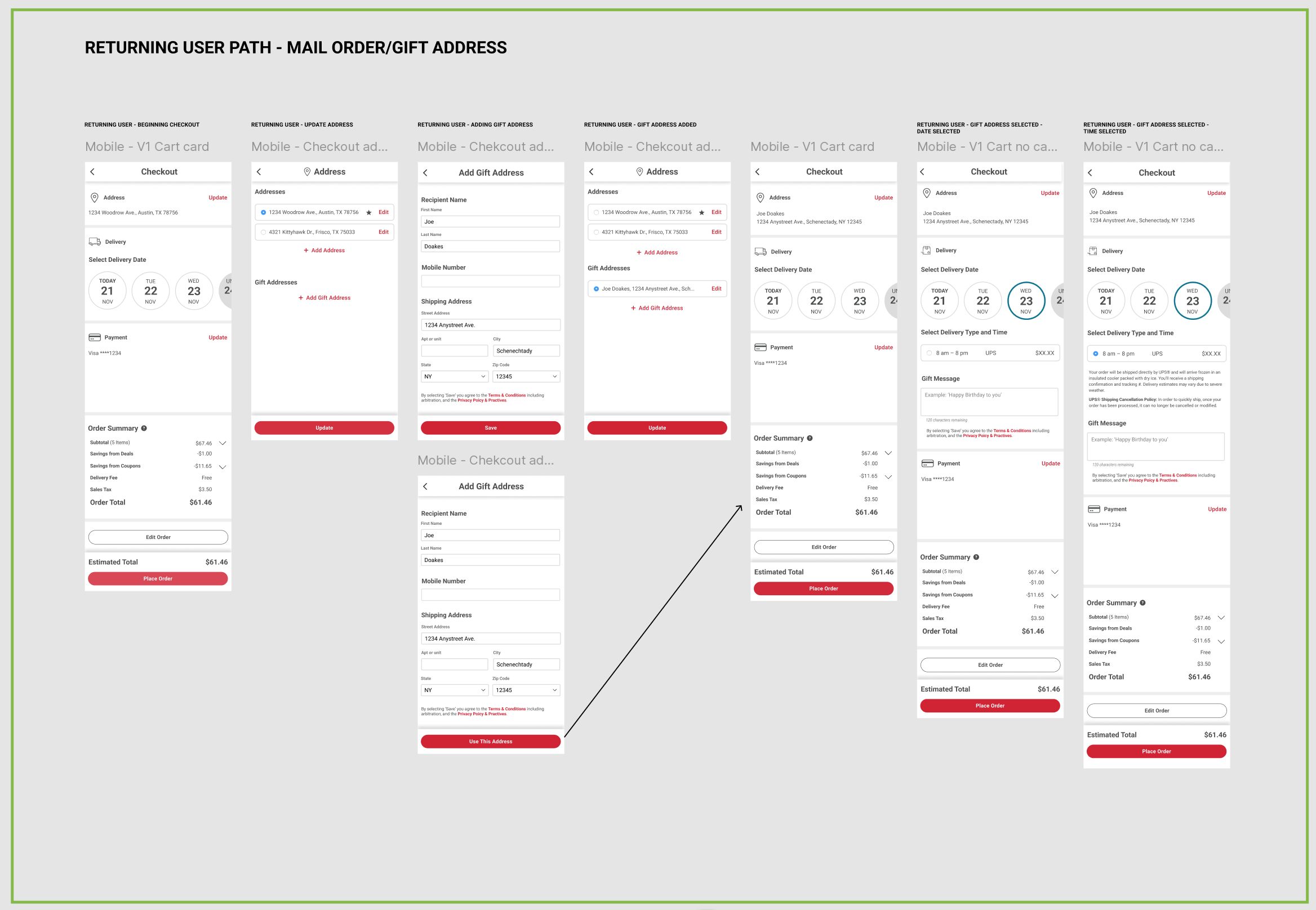
The below image shows the original multi-step process for checkout:
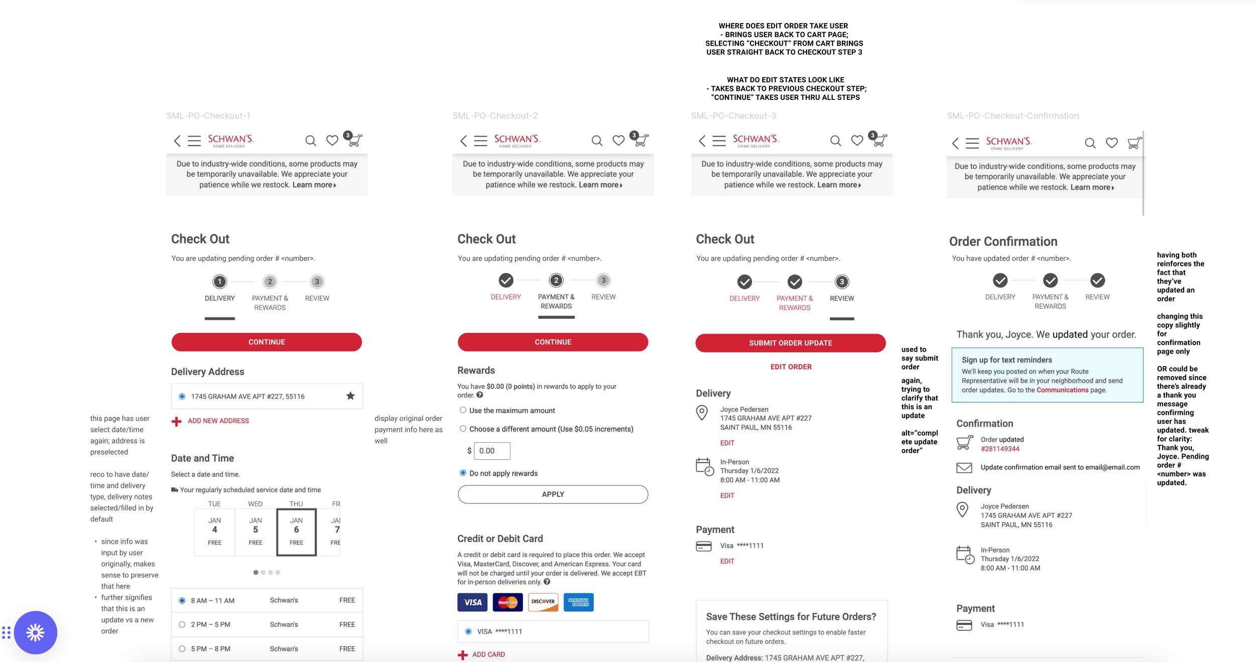
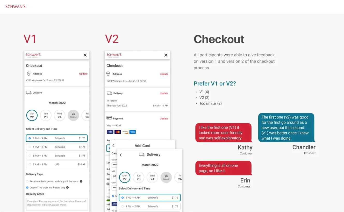
As an alternative, we combined the three screens into one continuous experience that incorporated panel menus to allow users to add or modify addresses and payment information, as seen below:
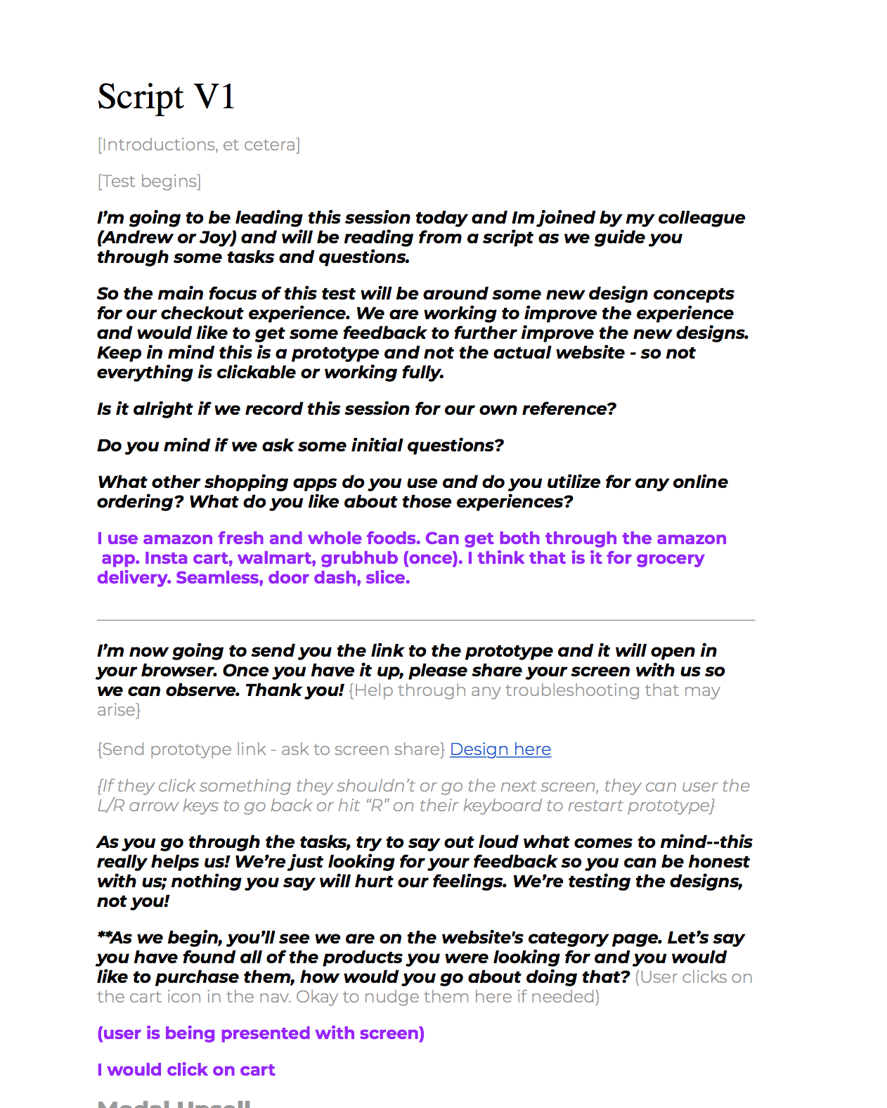
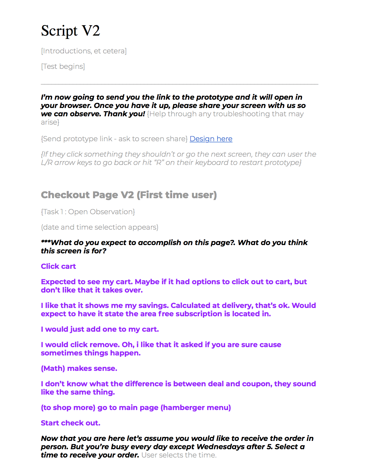
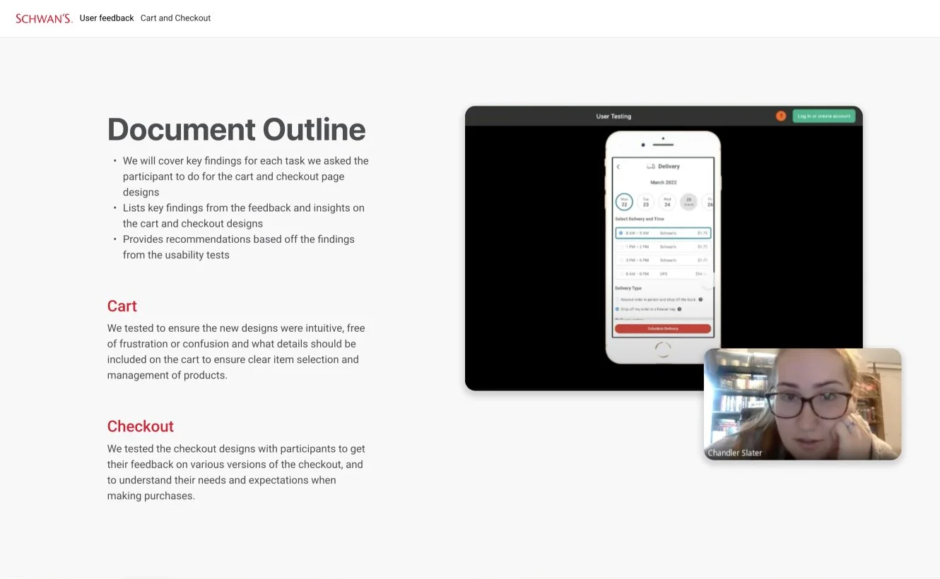
After building a clickable prototype of the new design in Figma, user testing began. A script was developed to guide the users through the experience and also to gather their assumptions, difficulties, and moments of delight. These sessions were facilitated through Microsoft Teams, and sessions were recorded for posterity.
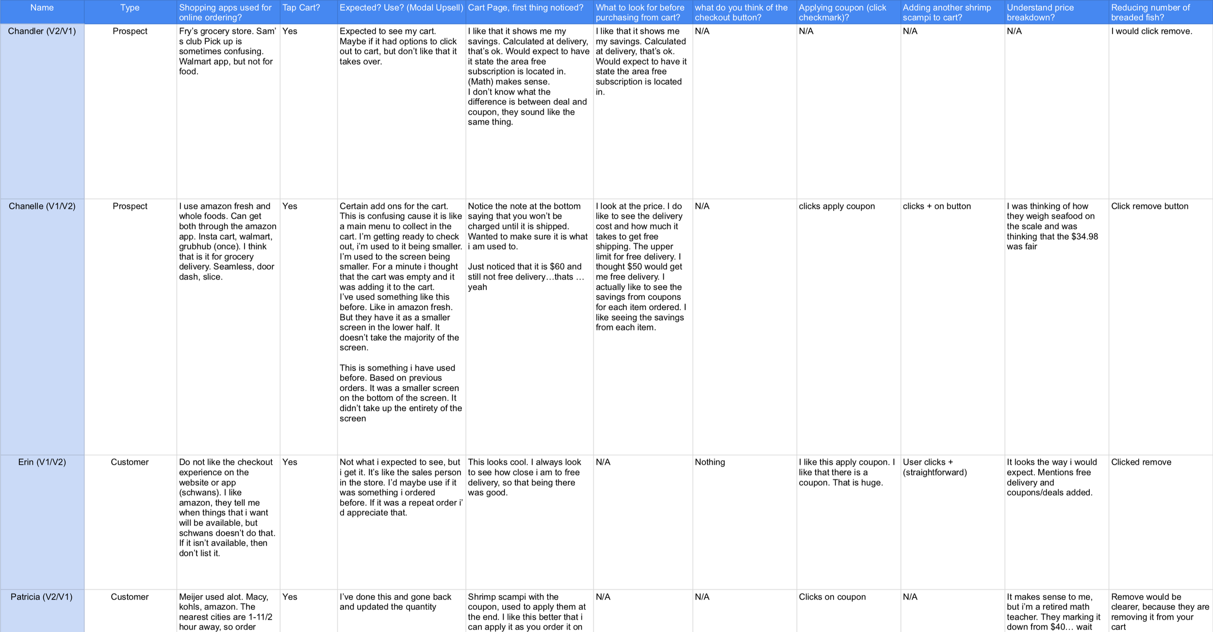
After they were done, all user feedback was combined into a matrix allowing the team to cross-reference the main points. The research and findings were put into a deck and shared with the e-commerce team and other business stakeholders.
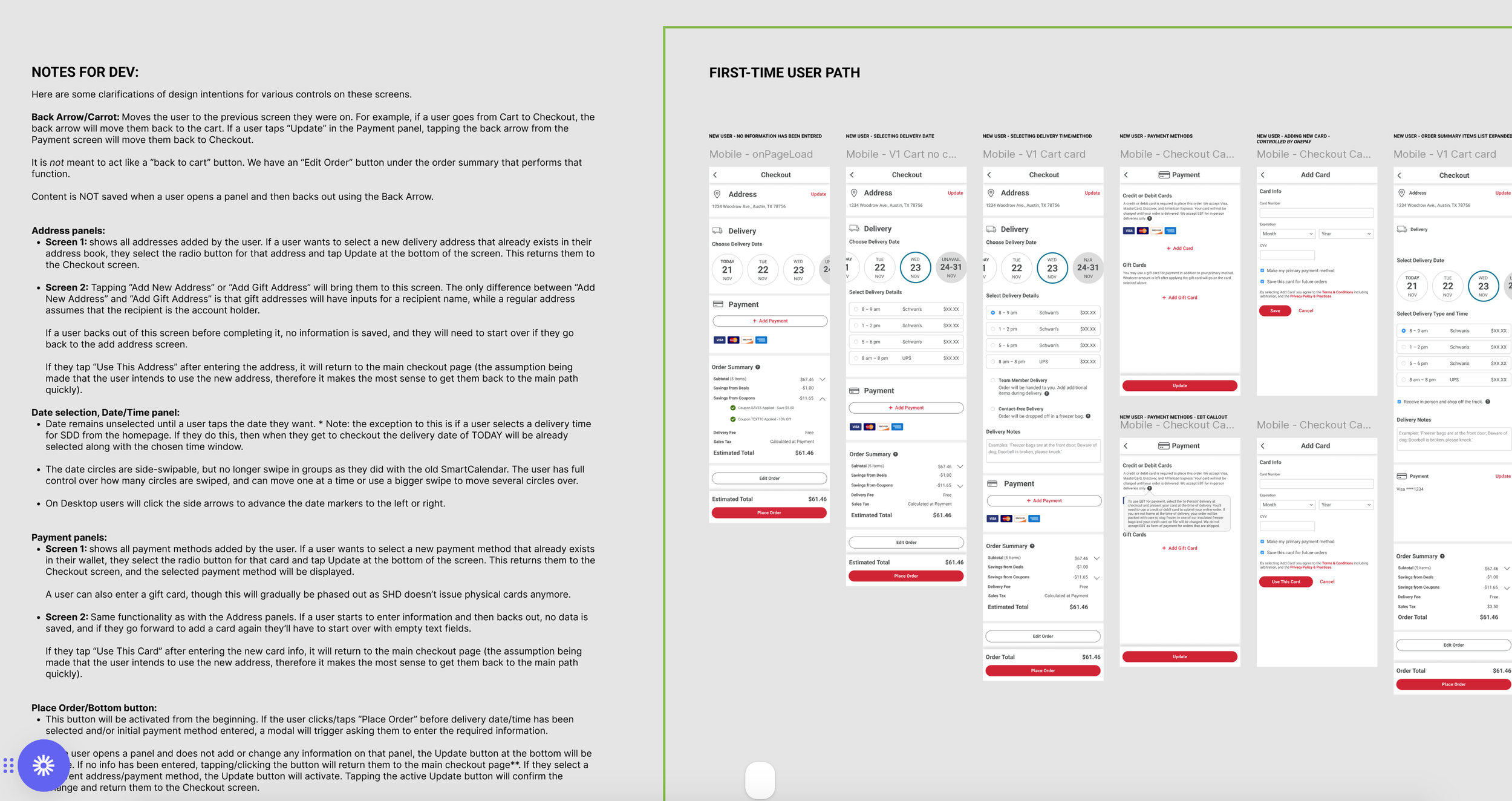
Once approval had been given, the team moved into the development sprint. I collaborated closely with our Front-End Developer to ensure a smooth handoff, complete with dev notes that he could reference as he built the final product.
Outcome
In April 2023, the same-day delivery feature was successfully launched on both the website and mobile app, marking a significant milestone in the company’s long-term goals. Within the first month the company saw an overall increase in user engagement with the site, and marked a 22% reduction in abandoned carts during checkout.
Further UX enhancements were made to update and improve the credit card payment experience, and EBT payment options were added to give users even more options.