Life Insurance Needs
Calculator
Role: Lead UX Designer
Responsibilities: UX Design, User Research, User Testing,
Data Visualization
Design Artifacts
-
![An image of a life insurance calculator that includes text fields and a "stepper" progress bar above it.]()
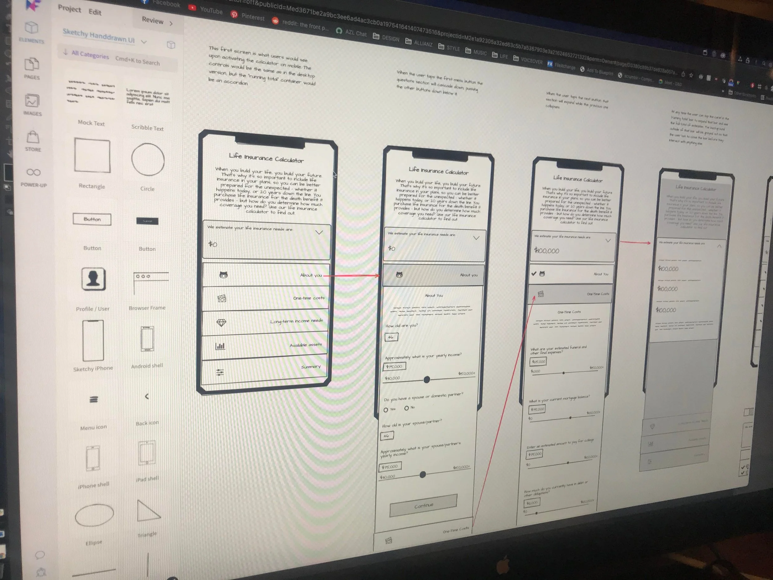
The Original Calculator
This is the original life insurance calculator. The very first question asked about funeral expenses, estate/probate amounts, and other specific details that many users didn’t know the answer to. Since this was a required answer, and since it gave the impression to most users that they had to have an exact amount in mind, most users exited the calculator at this point.
One user said, “I’d have to get on the phone with every one of these institutions or accounts and get an answer. It would just be a big pain.”
Another big concern was the lack of accessibility, primarily around the low contrast of the stepper text, tooltips, and the explanatory paragraphs at the top of each section. Meeting a AA accessibility standard was top priority during our 2019 rebrand and redesign, but a handful of elements, including this calculator, were carried over from the previous site.
-
![Hand-written notes and quick sketches illustrating how I wanted the user to be able to jump from screen to screen]()
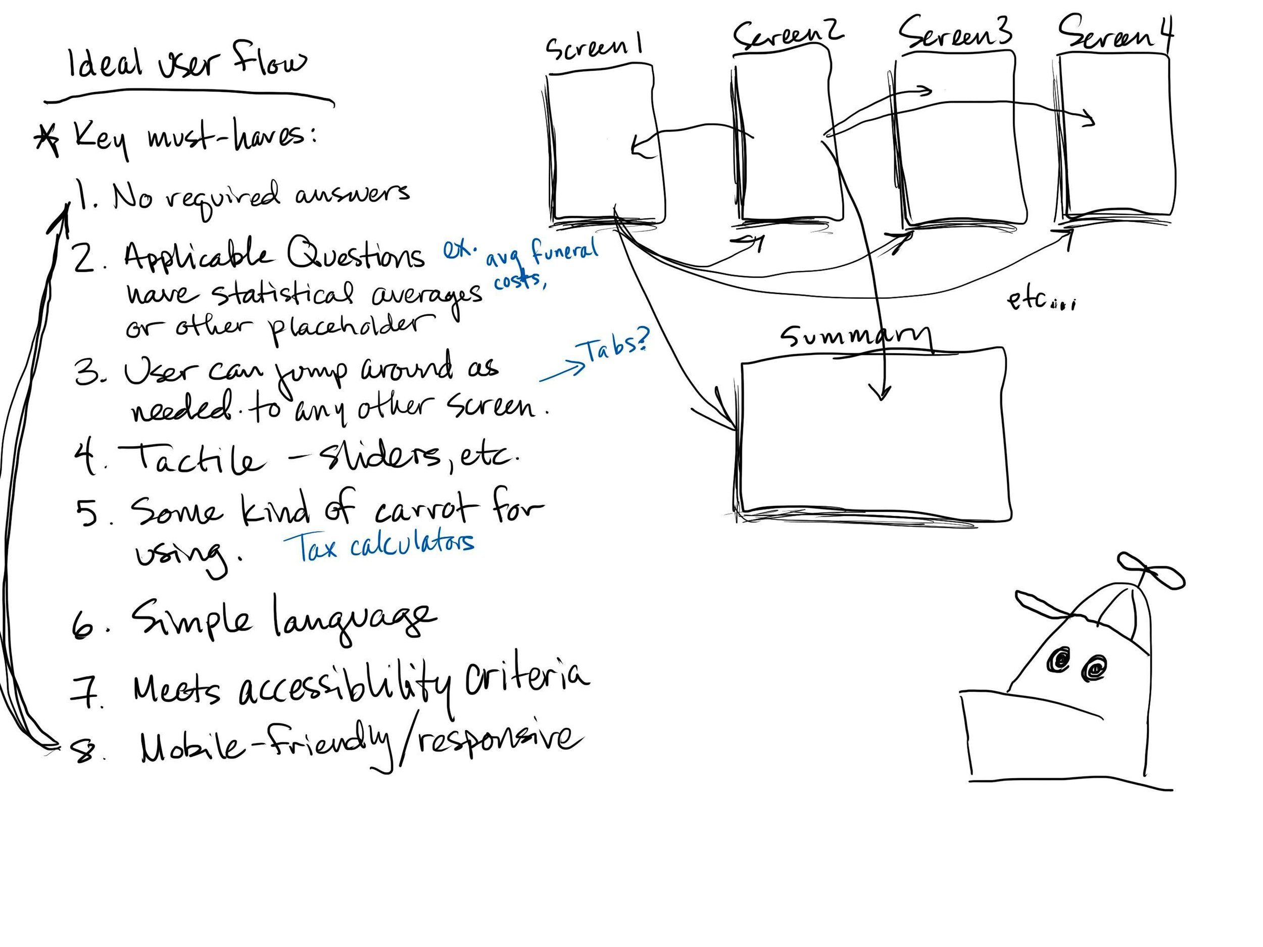
Forming a Plan
Here’s one of the sketches I made of the type of user flow we wanted to have with this new version of the calculator. It was important that we give the users freedom to jump between several different sections in order to allow them to have a less linear process. During this time we also started writing content and focusing on things like tone and organizing the hierarchy.
Some of these were done on my own and others were done in a team setting. The advantage of my iPad is that I’m able to use it as a whiteboard during online collaboration meetings. It’s not quite the same as sitting in a conference room with a whiteboard, but in this pandemic world it’s a very suitable substitute.
Special Guest appearance by Homestar Runner.
-
![A quick sketch showing three screens and the functionality they could have]()
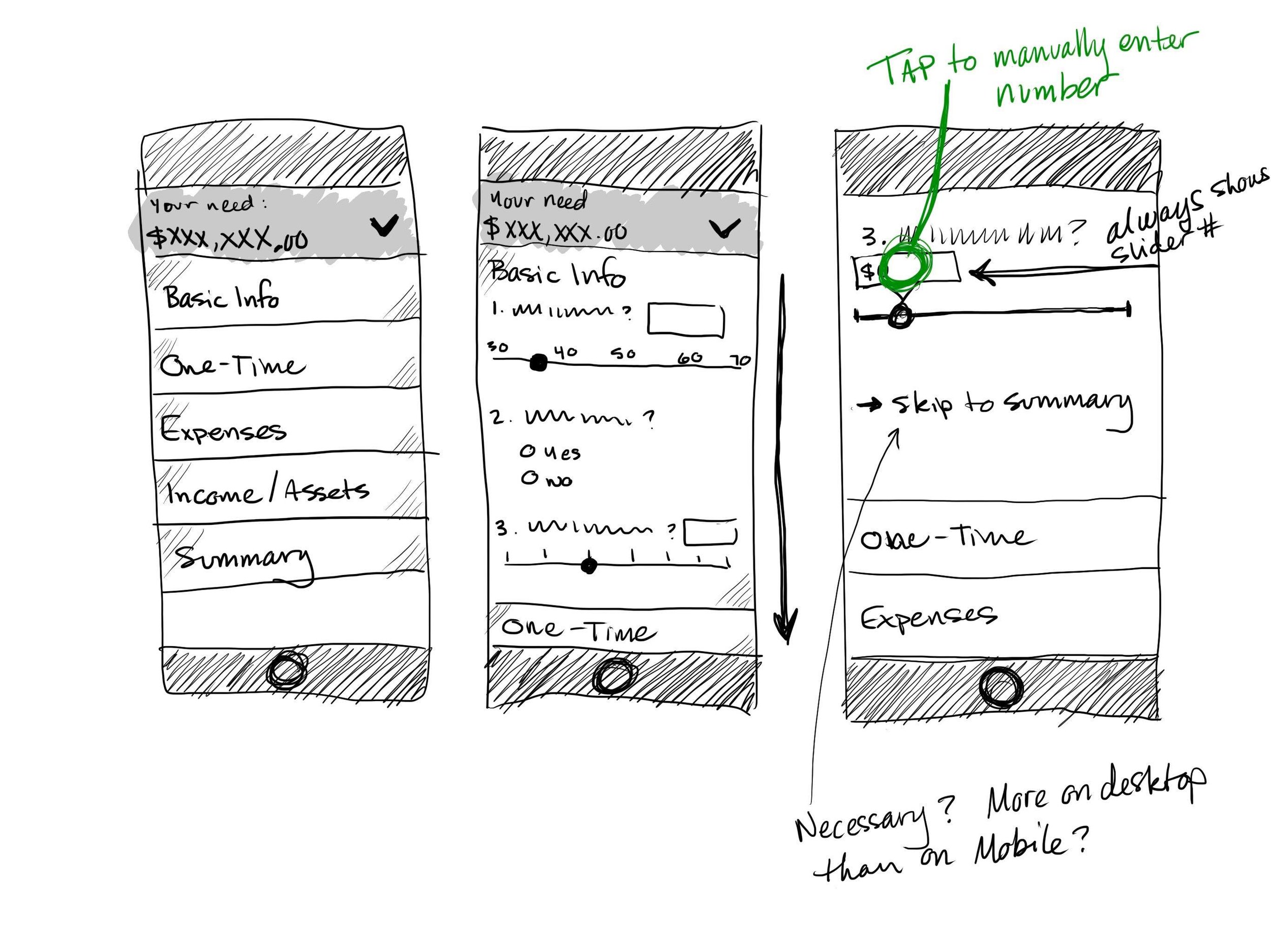
Rough Sketching
I like to begin as many projects as possible with sketching. As a lifelong drawer, it helps me to set the mouse and keyboard aside and engage a different creative part of my brain.
These initial sketches and thumbnails helped me sift workable ideas from the junk, and also allowed for excellent and efficient collaboration among the other members of my team.
The quality of my sketching varies depending on who my audience is and what level of detail is needed. If I’m presenting ideas to my team I’ll keep them fairly simple. If I’m presenting to stakeholders I’ll take extra steps to ensure my drawings are neat and tidy, and will use markers (if on paper) or layers (on iPad) to add shadows and tones to help it come alive.
-
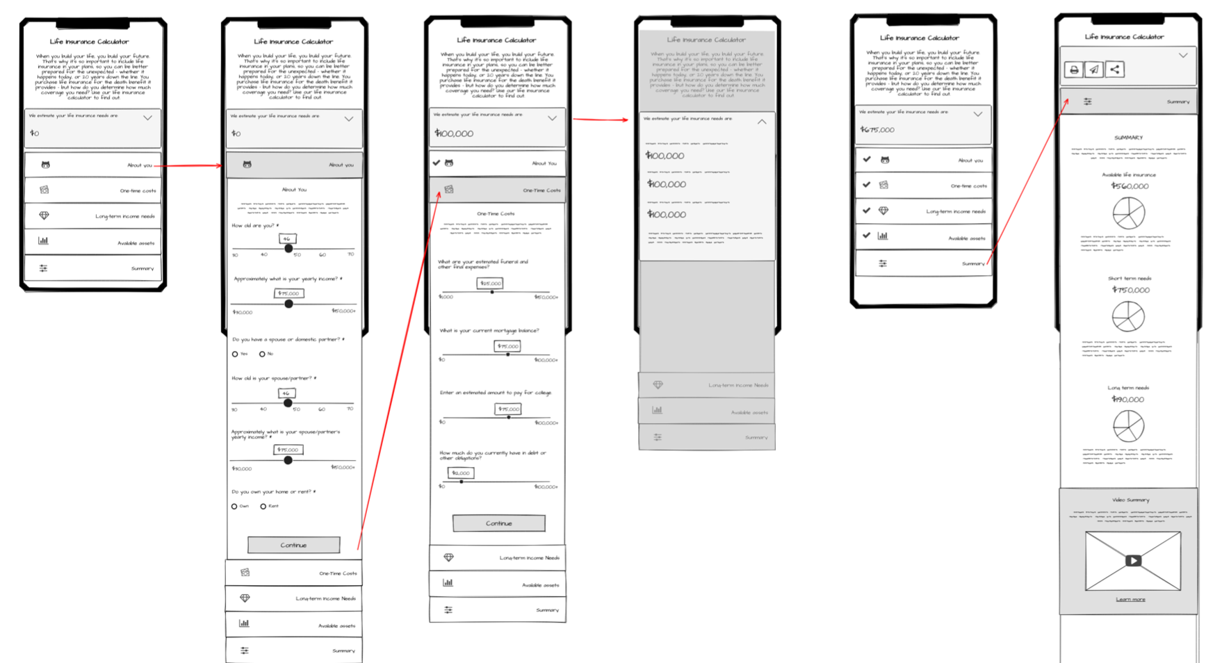
![A wireframe of several mobile screens illustrating how the user could go through one section of the calculator]()
Wireframes
Wireframes are a must for any UX project, and given the issues found with the previous calculator we knew they’d be especially important here.
I use Mockflow, a web-based tool that can do wireframes, user flows, site organization, and style guides. Previous experience has taught me that even in a wireframe with clean lines, clients can often focus on the wrong thing, like colours or content. To remedy that I use an intentionally sketchy style that helps reinforce the idea that we’re working with concepts and have not arrived at a finished product.
Another advantage of Mockflow is that it allows the designer to create a rough click-through prototype to help illustrate the user journey and functionality.
In the case of this calculator the wireframes were a necessity, especially when it came to mapping out what kinds of interactions we wanted the users to have, and how we wanted that path to flow.
-
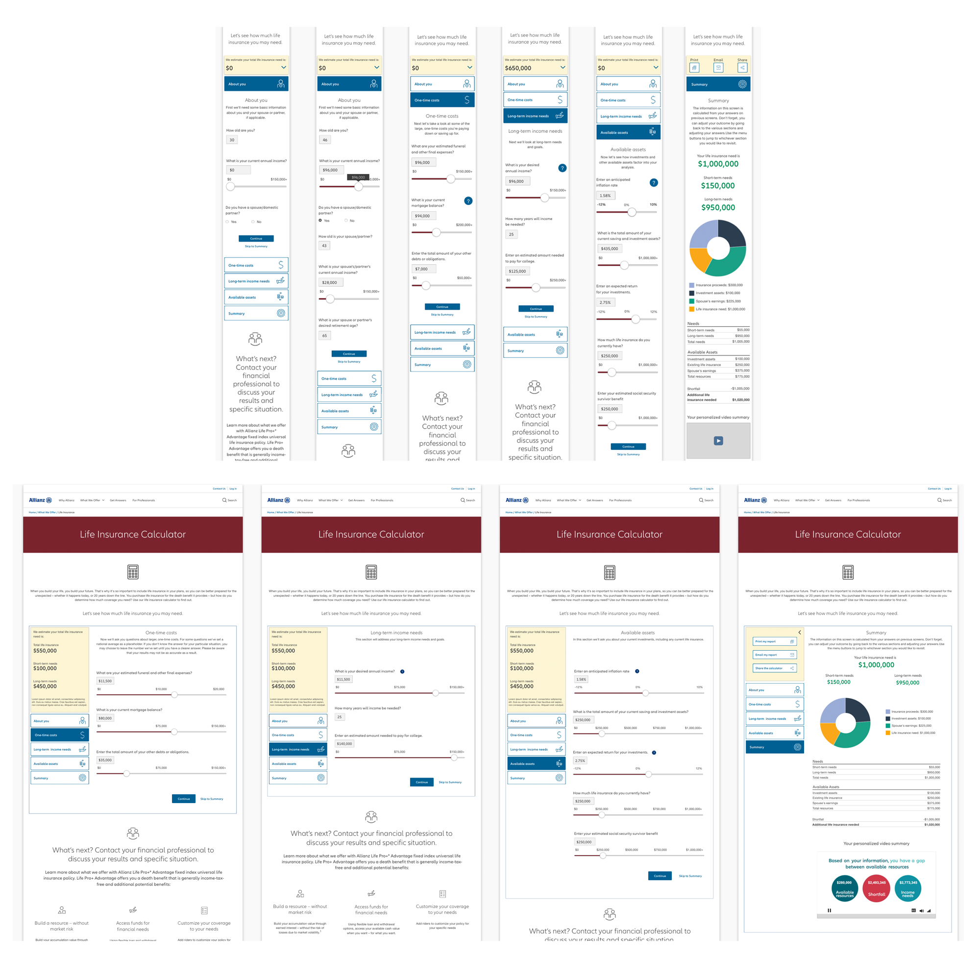
![Mockups of the final calculator showing both mobile and desktop views]()
Final Mockups
Once the wireframes had been approved I started building the final wireframes in Sketch. I started with mobile and worked my way up to desktop. The process went fairly quickly because we were using existing design patterns from our library, so in many cases colours were already decided for us. It really came down to choosing icons and adding content (which, because we’re in a heavily-regulated industry, proved to be the most tedious part of the process).
We went through two or three rounds of revisions, during which the developers were simultaneously adding my design touches to the final product.
Project Details
-
Allianz Life Insurance Company of North America had a life insurance needs calculator on their public site for many years, but user data showed that most users left very early in the process.
Our Customer Experience team conducted user interviews and found that most people found the questions unnecessarily specific and the design rigid.
Our Tools & Calculator team was tasked with redesigning an intuitive, user-friendly tool that would be engaging for users of all levels of financial knowledge, and have it completed in two months.
In addition to designing the calculator, we were also asked to engage with a third-party company that creates custom videos explaining each user’s results, which would entail not only working their video into our design, but also creating an API that would feed the results from our calculator to their matrix to return personalized content to the video player.
-
I began by trying to put myself in the shoes of our average user, many of whom are in their late 40s/early 50s and often don’t consider themselves particularly knowledgeable about matters like life insurance and retirement accounts (all of the products sold by Allianz are brokered and, in many cases managed, by independent financial professionals).
One of my teammates used Miro to create a user flow of the existing calculator experience and we found that it was unnecessarily rigid, unintuitive, and in several cases did not meet accessibility requirements. For example, a user couldn’t just click the stepper at the top of the calculator to jump to the next section; they had to fill in all required answers in order to proceed.
In researching other, similar calculators and tools I realized that many of our users merely wanted an estimate, so I wanted to create something that would allow them to skip over questions they didn’t know the answers to in order to get the final result.
Since one of the cardinal requirements of a good user experience is delight, I sought to make something that a user would want to come back to multiple times.
I also realized it was important to offer them something that would keep them engaged through the whole experience. Inspiration came from online tax tools, which often display a running total of their tax refund or balance as they continue through the process.
-
The interface I designed in my concepts would allow the user to skip back and forth between different sets of questions, show them what their running insurance need is, and put in financial averages in questions they themselves didn’t know the answer to.
At the end of the sketching/concepting phase I put together a rough wireframe prototype (more like an interactive animatic) that illustrated the basic functionality and demoed it for the stakeholders. They loved it and were excited to see it come to life.
I began by showing my basic ideas and sketches to our two developers (one Sitecore dev and one React and the project manager, asking “Is it possible that we could do something like this?”
The devs reacted enthusiastically and started building a rough prototype while I worked on mobile and desktop wireframes.
At the same time, we collaborated with the third-party vendor regarding the personalized video, particularly around the area of accessibility.
Several times a week we met to look at my wireframes, the developers’ rough prototypes, and solicit feedback from the stakeholders, mostly pertaining to question-specific content and wording (the financial industry is heavily regulated and compliance is one of the company’s primary concerns). I also sought feedback from other Allianz designers during weekly design reviews, and their feedback proved very helpful.
We continued to iterate in this way through each of the different question groups until we had solidified our journey map and content.
This process continued throughout the mockup stage, where we fine-tuned our colours and icons.
-
Since Allianz has a proprietary global design system and a wealth of branding material, the process of adding colour to the design was fairly straight-forward.
The biggest challenge at this stage, though, was the lack of testing. Since more widespread testing methods were not available to us, we decided to test the calculator among a handful of other employees within our QA environment.
One thing we discovered was that the slider range was not precise enough for some of the financial questions, like annual income, investments, and how much life insurance they had. Users had a hard time dialing in the amount they were looking for with such small space available, especially on mobile. Rather than have some questions with sliders and others without, the stakeholders chose to remove them altogether for a simpler experience.
In the end, the stakeholders were very pleased with the final outcome, and the marketing channel manager nominated our team for Team of the Year award.